Rapid Clean and wrapped

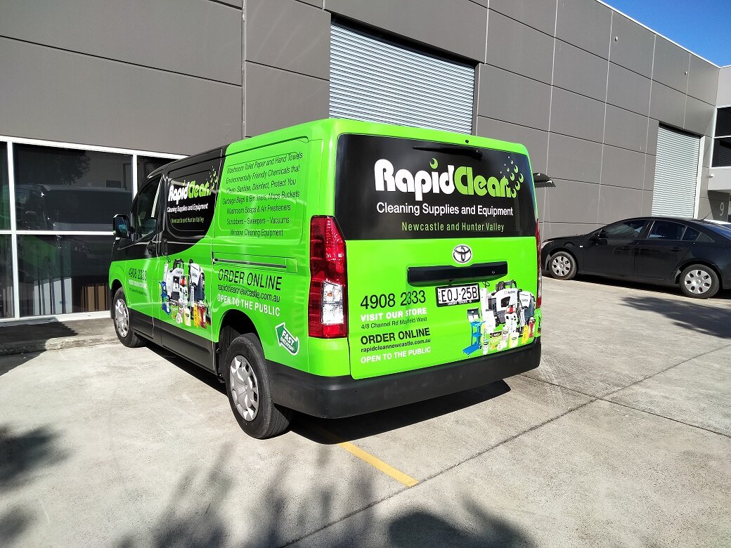
Rapid Clean have been busy wrapping their new fleet of vans.

VW Crafter Wrap

Firstly we got design and wrap the VW Crafter in the brilliant green.


Toyota Hiace Wrap

Then we had the new Hiace- the design was a little different fort his one. The frog got the boot.


Shopfront update

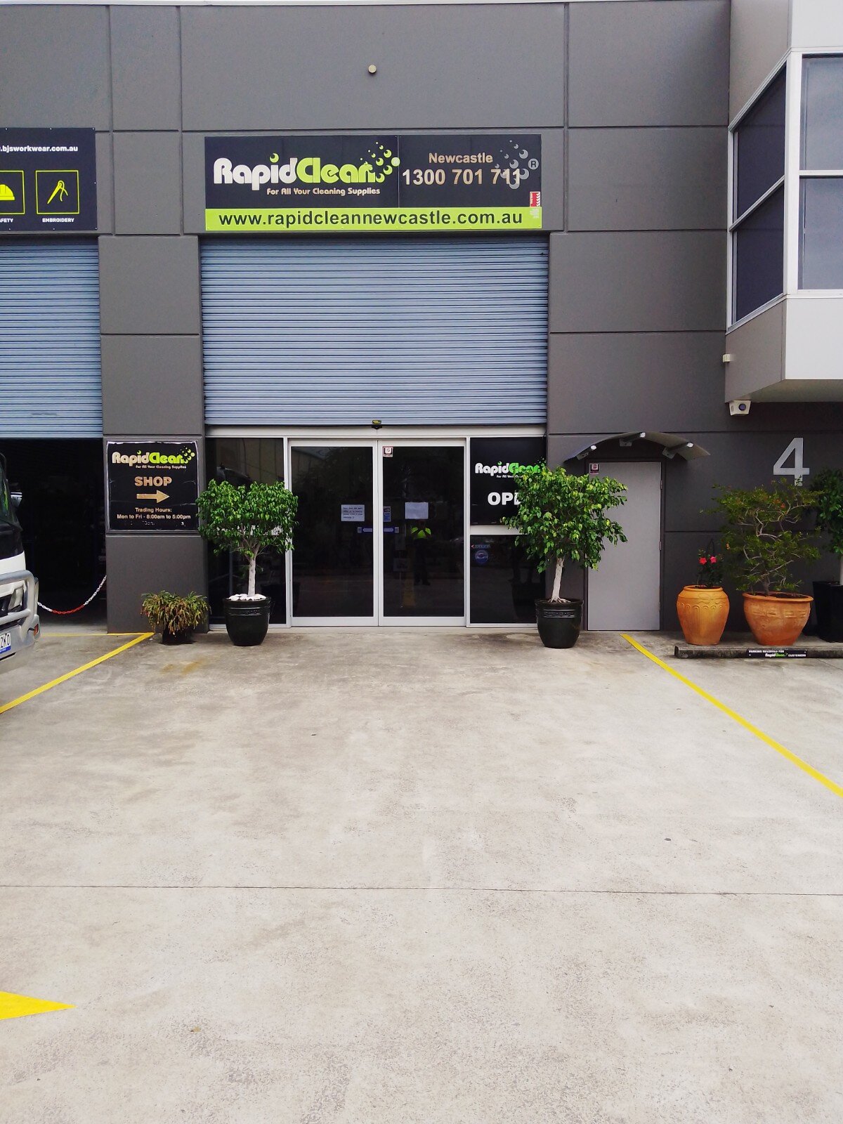
We even did a spring clean on the old signs for their shopfront. The vinyl had aged and was breaking down so we updated the colours and new logo.

Meet Ozzie Meats

Shortland is starting look good now Ozzie Meats have arrived.

Not only do they have the best signs but also only the freshest, finest quality meats.

ozzie meats shopfront TGC.jpg
 

Routed aluminium composite panels were supplied for the main awning signs and the shopfront was dressed with perforated vinyl graphics.

The logo brief was Ozzie flag, free style fonts mixed with new and traditional style layout. So many options.

Custom meat tickets were designed along with meat pack labels and promotional images.

 
ozzie meats logo stack rgb TGC.jpg
ozzie meats meat packs fb TGC.png
ozzie meats meat ticketsTGC.jpg

Meat tickets

Custom designed

Rev Fit Pumped and Sign Ready

Rev Fit launched their new gym in Tamworth recently and we were lucky enough to be part of it.

RevFit is a Functional Training Facility based in Tamworth NSW Australia.

rev fit team.jpg

Meet the crew

Revival - "an improvement in the condition, strength, or fortunes of someone or something."

Paul Lawrence - Owner / Coach

Paul brings a wealth of experience to the REVFIT team, having owned and operated a vast range of businesses with his most recent The Athletes Foot Tamworth. He has played and coached Rugby league sides across NSW, he loves the team’s aspect of REVFIT training. Paul is also a Qualified personal trainer who specialises in interval training and Thump Boxing sessions.

Paul has 2 kids Hannah and Bailey and has been married to his lovely wife Kirsty for nearly 20 years .

Bailey Lawrence - Student Trainer

Bailey is the youngest of the crew is super keen to continue in the Fitness industry through a REVFIT scholarship. He is currently studying year 10 at Farrer Agriculture School here in Tamworth. Bailey is very active playing both Cricket and Rugby Union at a high level. He is a very approachable lad, Bailey is always around for a helping hand and to push you to achieve your goals.

Ben Pearce - Coach

Ben has recently just completed his HSC and is currently studying teaching through Armidale UNE.

He is a avid Basketball player and coach, heavily involved in the local Tamworth Basketball community.

Ben currently has his Certificate 3 in Fitness and looking to add a Certificate 4 in Fitness in the very near future.

He is always up for a chat and enjoys spending time with the REVFIT members, helping them to achieve all their goals.

They have an amazing community at REVFIT!

If you’re feeling like your training has plateaued recently or if you’re just looking for something fresh, give them a call! They would love to show you more of what they do each day.

active kitchen’s signs

Have you seen the brilliant blue signs at Active Kitchens yet?

They look amazing! The blue triangular design really pops off the wall and hits you as you are driving up the road. Contrasting with the now grey not green it looks even better.


The transformation was awesome to watch


Now the building matches the rest of the moving billboards. As a set they look very impressive

Quick Dash into Mount Hutton

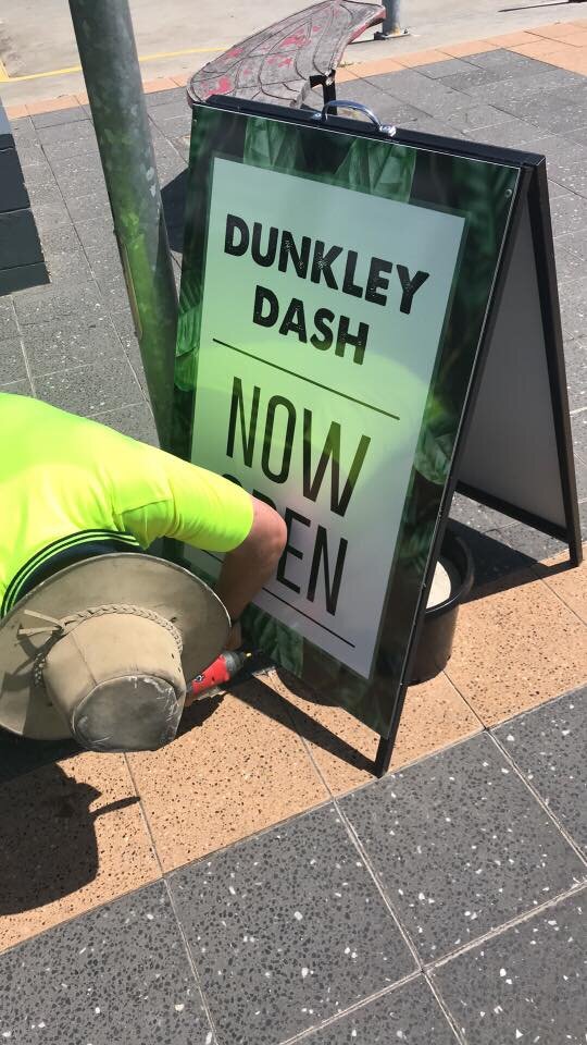
Dunkley Dash Espresso Hut has a fresh new look!

We had the pleasure of working with the crew from Dunkley Dash sprucing up there shopfront.

packaging.JPG

Julie was great, she knew what she wanted and how it should look, made our job so much easier. Did i mention how good their coffee is!

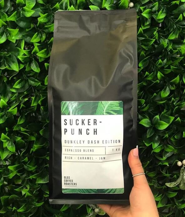
Our Design Team created their new presence. Fresh greens, contrasting against the stark crisp white and black. Those with a keen eye will see that the leaves are actually coffee plant leaves, appropriate we thought. The log was inspired from their new look coffee bag labels


Dunkley Dash pre make over.jpeg

old look

Pre makeover

Dunkley Dash post make over.jpg

new look

little bit of magic

New sign panels were designed and installed on the side of the building replacing the single sign panel. This has great street view frontage as you are coming down the hill. A little of personality was added with the quote on the second panel, after all coffee is all about warmth and getting that good feeling.


Add an a-frame fresh’n up - couple of new sign panels, and trading hours decal on the window installed and the look is complete.

With Breast Cancer Awareness Month being so dear to Julie, we also made some t-shirts and a posters for her campaign.


Dunkley Dash breast cancer tshirts.jpg

Breast Cancer Ts

Custom designed shirts for the lovely ladies

Chanelle & the team have been nothing short of fantastic, we couldn’t be more happier with our new signage for Dunkley Dash thank you so much guys
— Julie Roach

Hitensile has a new face lift

Newcastle Hitensile and Bolt have had an exciting upgrade.

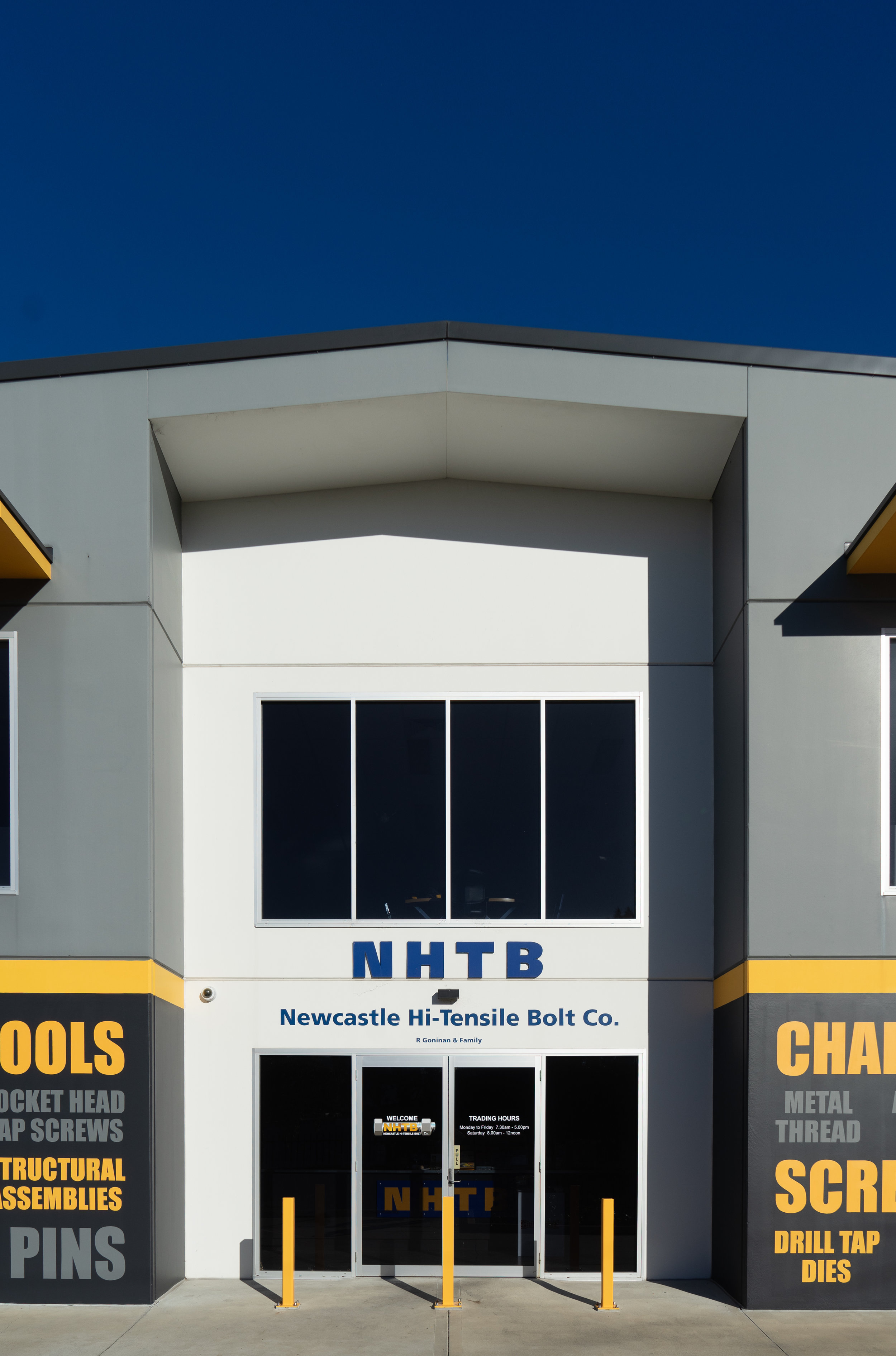
A fresh lick of paint, new signs, new car park lines and markings and the tired old building looks brand new again. Perfect for our snappy photographer to capture this industrial beauty.


It is amazing how powerful words are really. The visual impact of such strong and contrasting tones the words bring across the front facade of their building is impressive to say the least. The Building now has it’s place along the road.


The task on this site was to freshen up the front where the customers enter the building. So our Think Team got working and created this idea of a collage of words, relevant to Hitensile of course. There were some extremes in temperatures and weather, but the results of the hand painted words look fantastic we think.

Standing tall out the front the pylon sign had a make over as well- new sign panels with the new logo and branding. Trading hours applied to the front entrance doors.

We cannot forget the ground! New lines were measured out for the spaces and the car park markings were also repainted.

For the final touch a bit of painting across the front and shiny yellow bollards for greater safety around the site.

All that was left was to capture the moment of such brilliant silent acting. So with camera in hand, our photographer Andy snapped away. The model was a minx, such strength and poise, every angle was her best. :)

Crema Coffee Garage hoisted

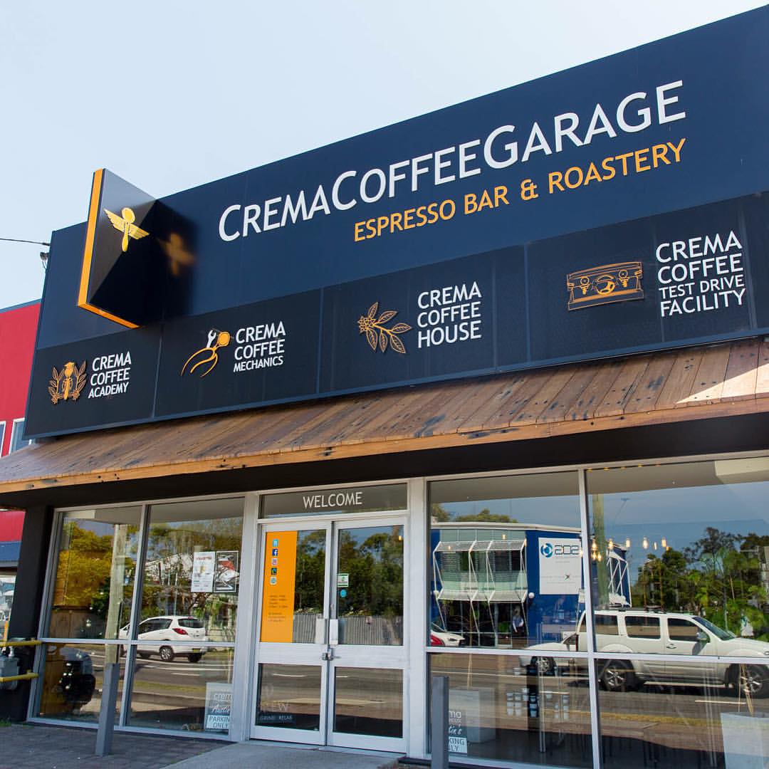
Royce had a great time up in sunny Queensland branding Crema Coffee’s new premises.

The front facade was laminated with one way vision vinyl designed by the Crema’s fantastic design team. This acted as both informative, decorative and added some much needed shade for the showroom. Out the front in their lovely new pruned garden, a street sign was erected towering over the hedge - great for traffic exposure.


We love their branding so clean and simple and their Pegasus is so easily recognisable.


crema coffee garage great coffee.jpg
crema coffee garage queensland front.jpg
crema-coffee-garage-queensland-one-way-vision-signs-front.jpg

Since we began roasting coffee for our own cafe, Crema Coffee Garage has quickly become a household name.

The brand has become synonymous with quality fresh roasted coffee, whether it be for your home, office, cafe or whatever the cause of your caffeine addiction.


Crema Coffee Garage has an array of blends and single origin coffee beans available in its range, designed to cover a broad range of flavour preferences. People quite often ask us why our coffee is different and the answer is simple: we have a passion for coffee and we strive to give all our customers unique, memorable coffee moments.


start with the outside first

Your shopfront appearance is a key factor to getting customers in

If you are looking to attract more attention for your business – start with the outside first - shopfront signage.

Fascia signs, lightboxes, hanging signs through to frosted film windows or one way vision

Our team will collaborate with you to help transform your shopfront almost any way imaginable.

Being able to create and express your image to the public is such a rewarding project


LEOGATE ESTATE WINES


What a hard days work this was!

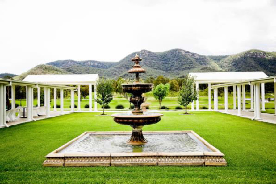
Leogate Estate Winery is simply gorgeous

Brokenback Vineyard was planted in the mid to late 1970’s by a Rothbury Estate Syndicate led by the late Len Evans AO, OBE. Over the ensuing years the vines have produced premium wines which have been sold under a variety of labels.


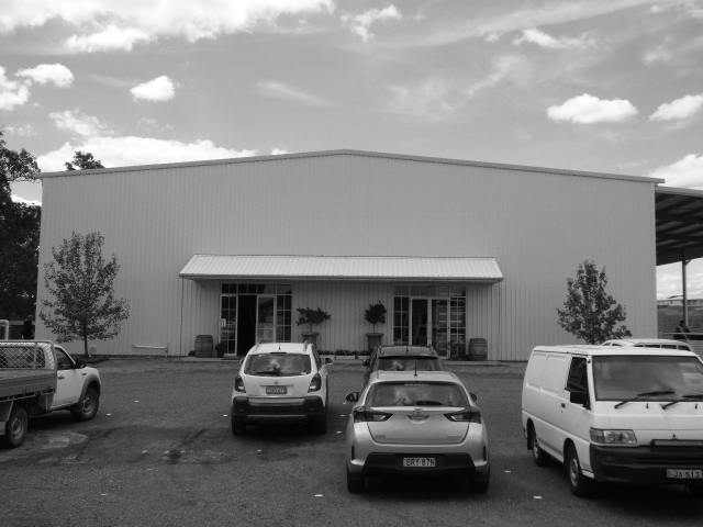
As stunning as this looks there was no branding on the entrance of the enormous building. So our job was to make an impression as you drove up the driveway.

 
Photograph of Front of Winery.JPG

Before  

Royce still needs to paint his magic


Handpainted directly to the surface these letters were over a metre high and spanned around 17 metres long.


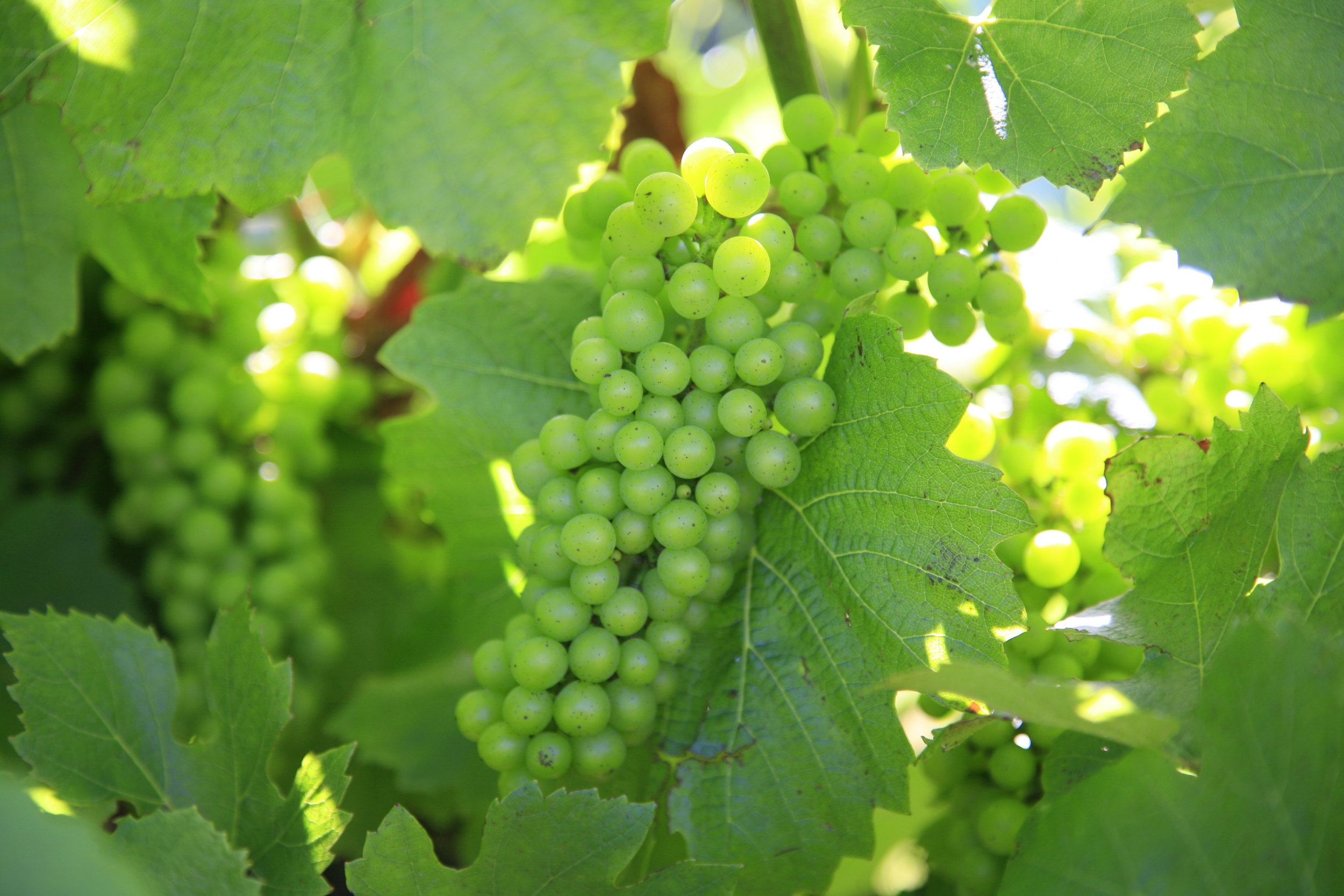
The current vineyard has 50 hectares under vine, comprising Chardonnay (18.1ha), and Semillon (3.9ha) on the flat gravelled soils and Shiraz (28ha) on the eastern and western-facing slopes of the adjacent rise as well as Verdelho (2.5ha) and Tempranillo (1ha) which were planted in 2009 (which Royce had to test them all).


Darby Street Butchers branded

Think carved it up with Kyle and Chanelle at Darby Street Quality Meats rebranding their image.

I know what you saying... another Chanelle!!! Well you wouldn't believe it there are not 1 but 2 Chanelles working there, so I felt right at home

Back to the story

The crew were happy with the bull and blue colours of their original logo, but just wanted it to have a bit more grunt and attitude. 

darby street quality meats logoname in circle.png
darby street quality meats old logo.jpg

old logo

he was tough but not enough

darby-street-quality-meats-jerky.jpg

The Think Team also had to consider how the logo could be manipulated for the butchers meat tray labels and sooo delicious beef jerky labeling. OMG it makes my mouth water just thinking about it this stuff is goood. You have to try it!

So just the head of the beast was chosen, front on so you were looking straight into the eyes

We updated the front window keeping the image low to allow light and vision into the display. If you look up at the roof sign of the front facade you will also see the new logo standing proud overlooking the street.


Internally we got to have a bit of fun designing the feature wall

We noticed some old black and white photos of the butchers forever back in the hay day hanging on the wall. These had to be used in our design for the wall behind the counter. 

 
darby-street-quality-meats-internal-signs.jpg
 

The display cabinet has a static vinyl running across the top with whiteboard strips so specials can be hand written as they change, bit of a personal touch we thought. Inside the cabinet we designed labels for the variety of delicious meats they have on display, once again laminated with whiteboard panels allowing for hand written descriptions and ease of changing the labels.

 
think-business-branding-on-tshirts.jpg

stamped

custom printed shirts, long sleeves and caps, mobile advertising


Vehicle signage

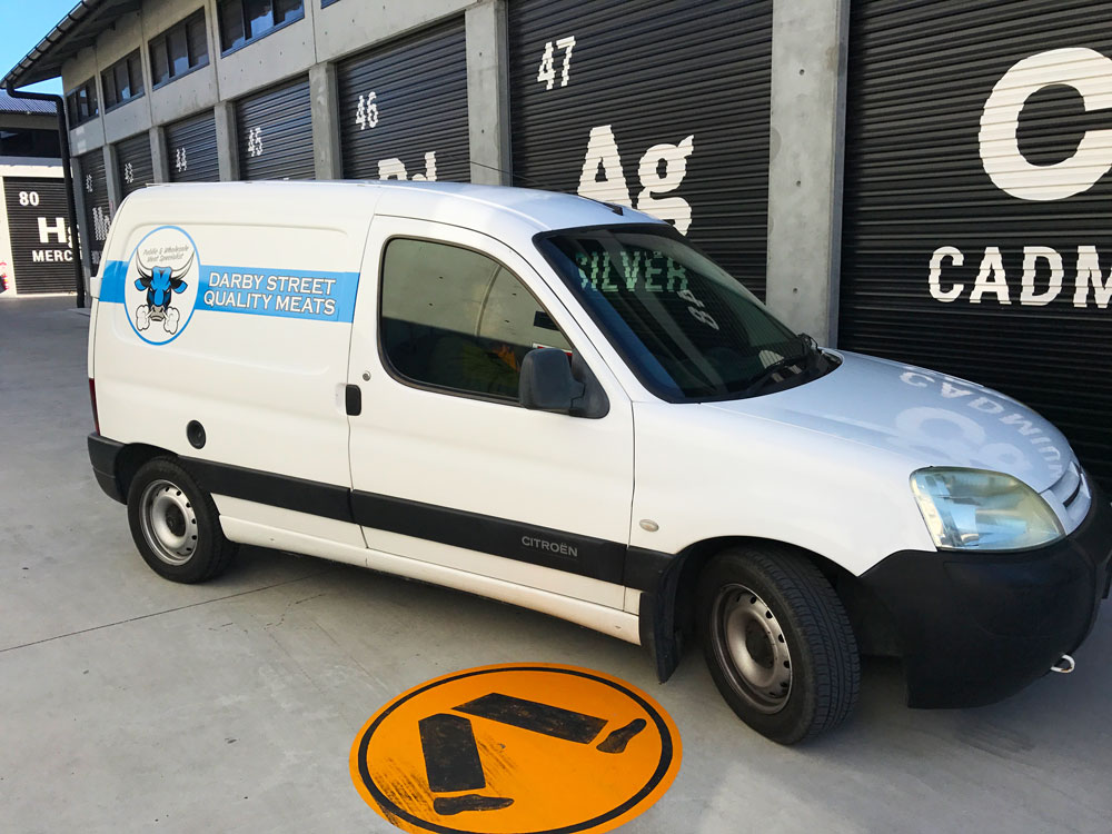
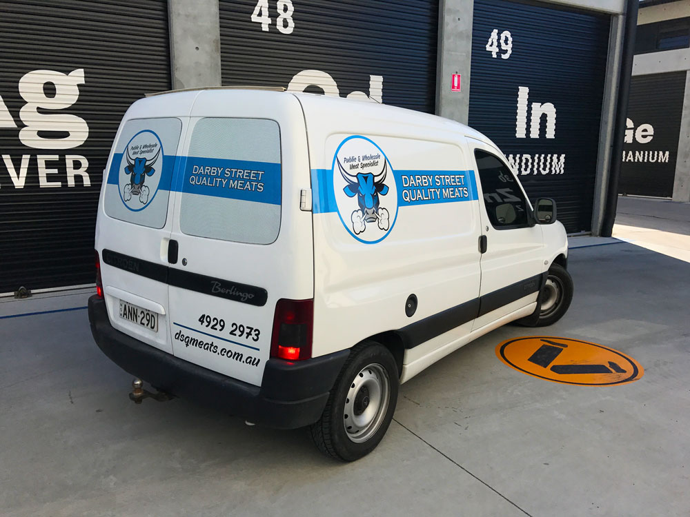
For the vehicles Kyle and Chanelle were just looking for something clean and not too loud. One way vision micro perforated film was applied to the rear windows and Hexis premium digital printing car vinyl on the sides and back panels.
 

LDS 3D in Broadmeadow

Another local company has opened their doors- Land Development Solutions.

The Think Team worked along side Helen from Swish Concepts to design this clean modern signage for the front of the building.


Swish Concepts is a well- established and hardworking boutique interior design consultancy located in Hamilton. Owner and Principal designer, Helen Brunsdon, has worked in the design industry for many years and loves all things design related.


The street frontage was perfect cars driving past all the time

Keeping this in mind the signs were kept low and close to the road to maximise visibility if you were driving from up the road near The Sunnyside Tavern.

With such a strong black background colour, the reverse logo was opted for greater contrast and the Street numbers in blue up high on both sides for ease of recognition.

LDS-signage-before.jpg

Before

LDS-signage-think.jpg

After


Simple yet clean, routed 3D PVC letters in various thickness, were mounted on the 2 faces of the building


Leading a team of dedicated professionals, Directors Brian Blight and Jason Harman provide a wealth of experience gathered locally, nationally, and internationally.

From issuing of plans to issuing of titles, feasibility studies, council applications, surveying, engineer design, sewer & water design, project management. LDS provides prompt personalised service across the spectrum of development needs.

Big Red Nose - New Signs

Think Graphic Communication were proud to collaborate with Red Nose to donate new signs for their premises at Hamilton South


for 40 years they were known as sids and kids. today their new name is red nose.

Red Nose's target is to reduce nine deaths a day to zero. that's their pledge to you.


As you can see the building was in need of some TLC. It didn't appear very welcoming


The new signage was kept minimal as traffic moves at a steady pace along Stewart Avenue, and high on the building for better exposure.

A splash of red made everything look so much brighter

Routed Aluminium Composite panels and Hexis vinyl were used for the manufacturing of the signs

Red Nose Mission is very empowering

Our Mission
Saving the lives of babies and children  during pregnancy, infancy and childhood and supporting bereaved families.

If you would like to know more about Red Nose or how you too can support them please follow this link


Thank you !

— Kate Middleton
We are so thankful to Think Graphic for our fantastic new building signage! We are now more visible for our clients to find us, and we love that the round signage matches our big red nose. As a not-for-profit organisation, we are very thankful to local businesses who are able to donate their time and materials, which enable us to use our income to support families who have experienced the death of their baby or young child. This support includes free counselling, 24hr telephone support, parent support groups and more. Red Nose receives very limited government funding, so we are very reliant on donations and fundraising to keep our drop-in centre open.
Thank you Royce and Chanelle
— Kate Middleton

The Concept brought to life


Think Graphic Communication helped make Newcastle's Newest Sporting and Fitness hub's dreams a reality!
 

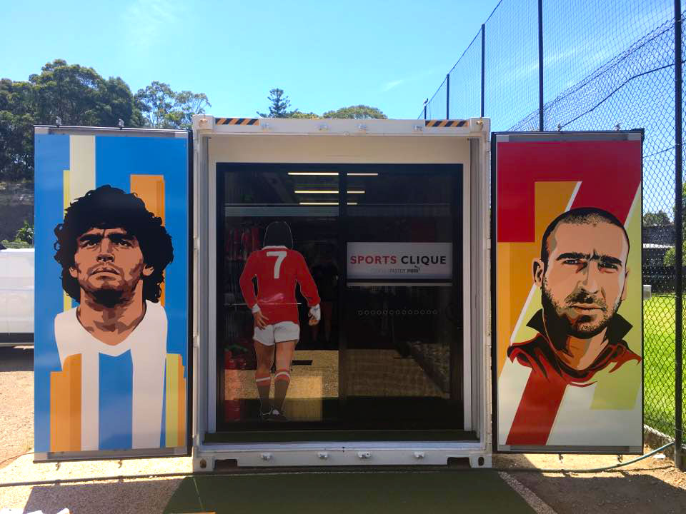
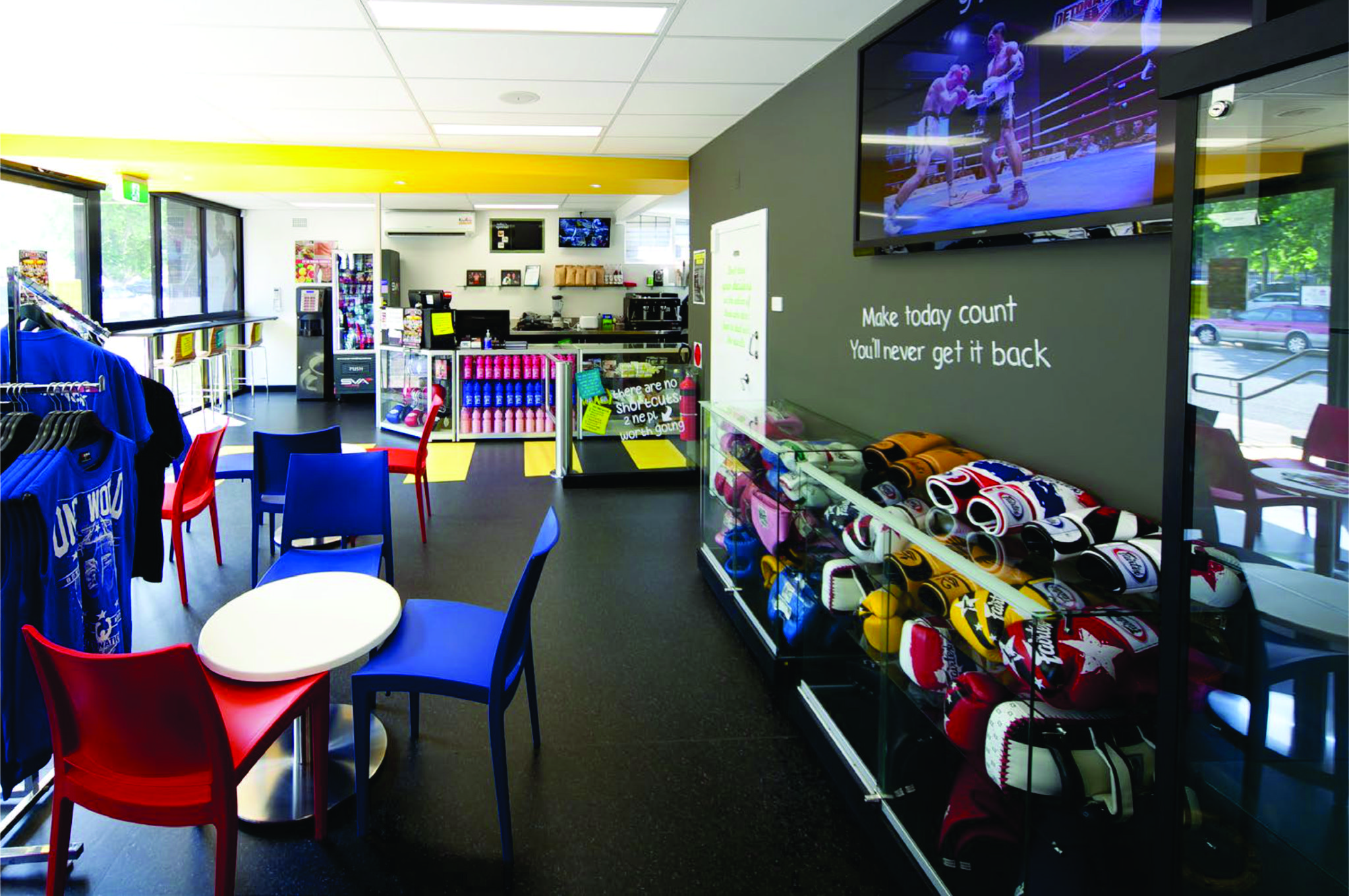
The Concept Gym we shopfitted in Newcastle, is now located 16 George St Highfields right near the Azzurri Club and next door to our mates at Sports Clique

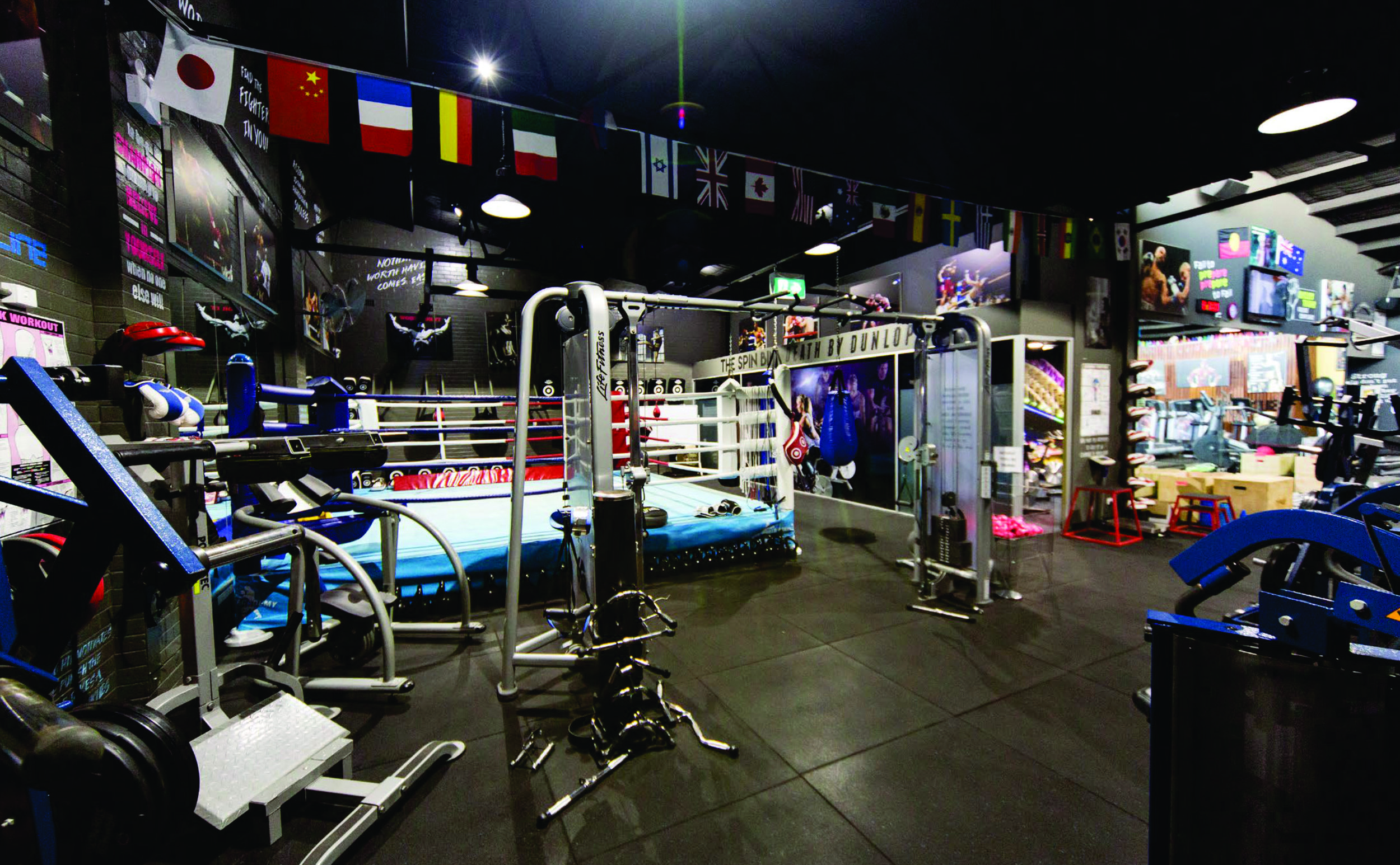
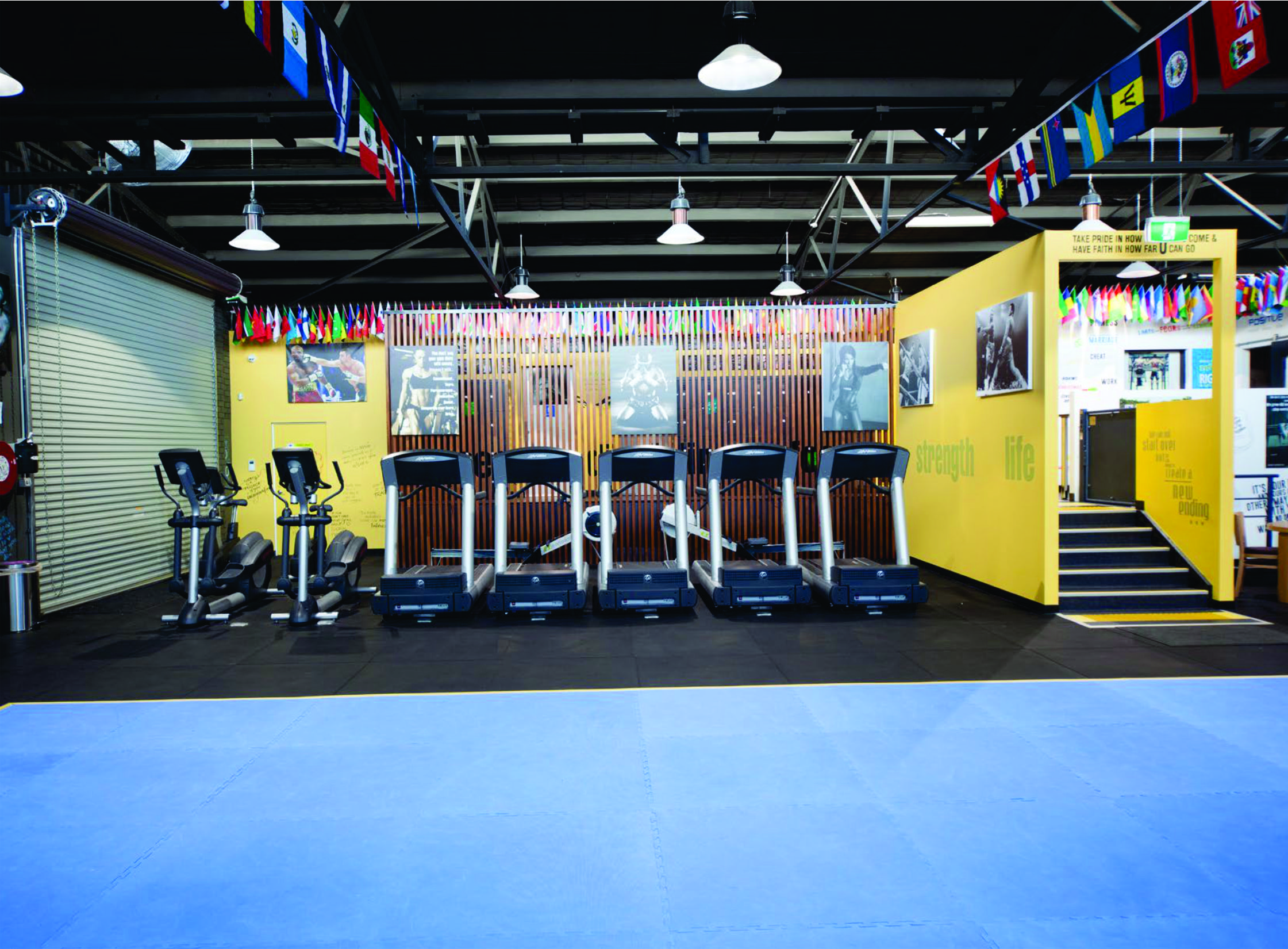
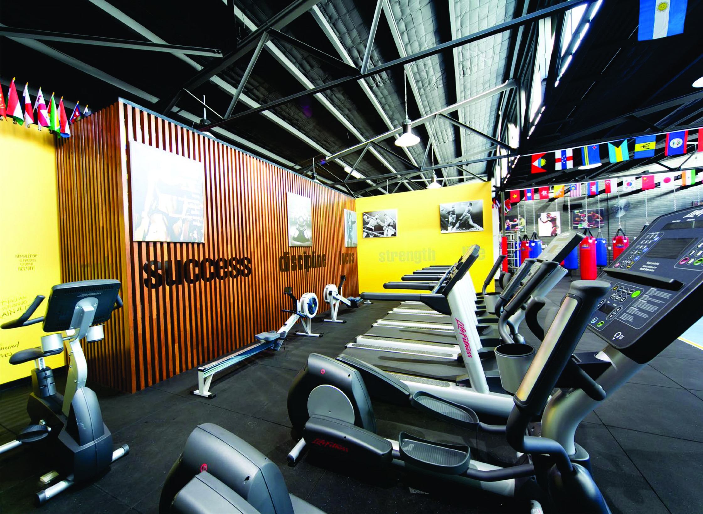
The Gym has loads of Hammerstrength Equipment, Group Classes, Crossfit and recovery facilities.


Similar theme to the old gym


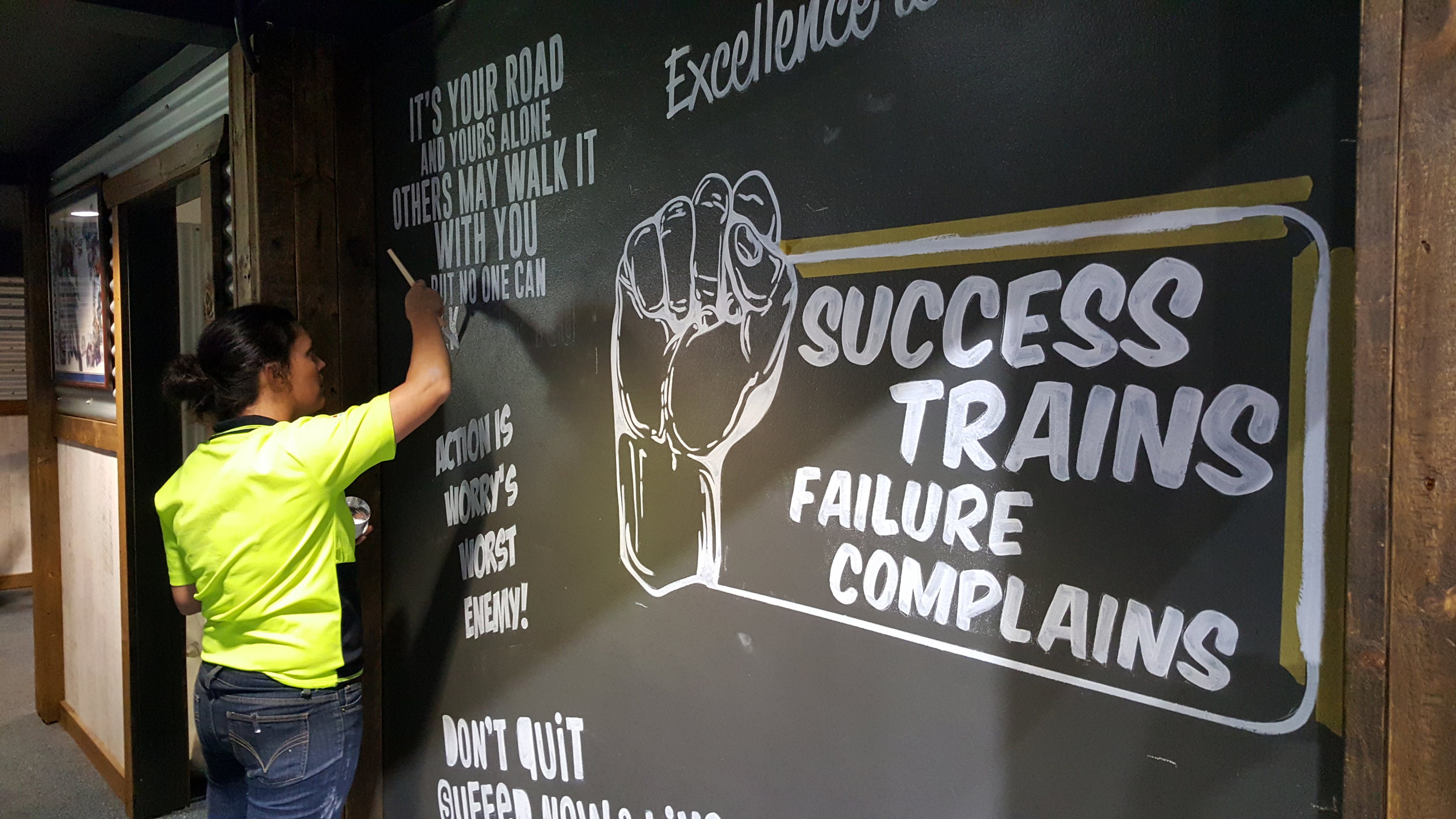
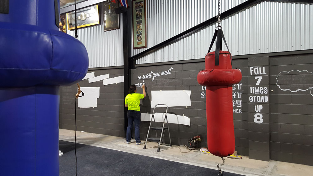
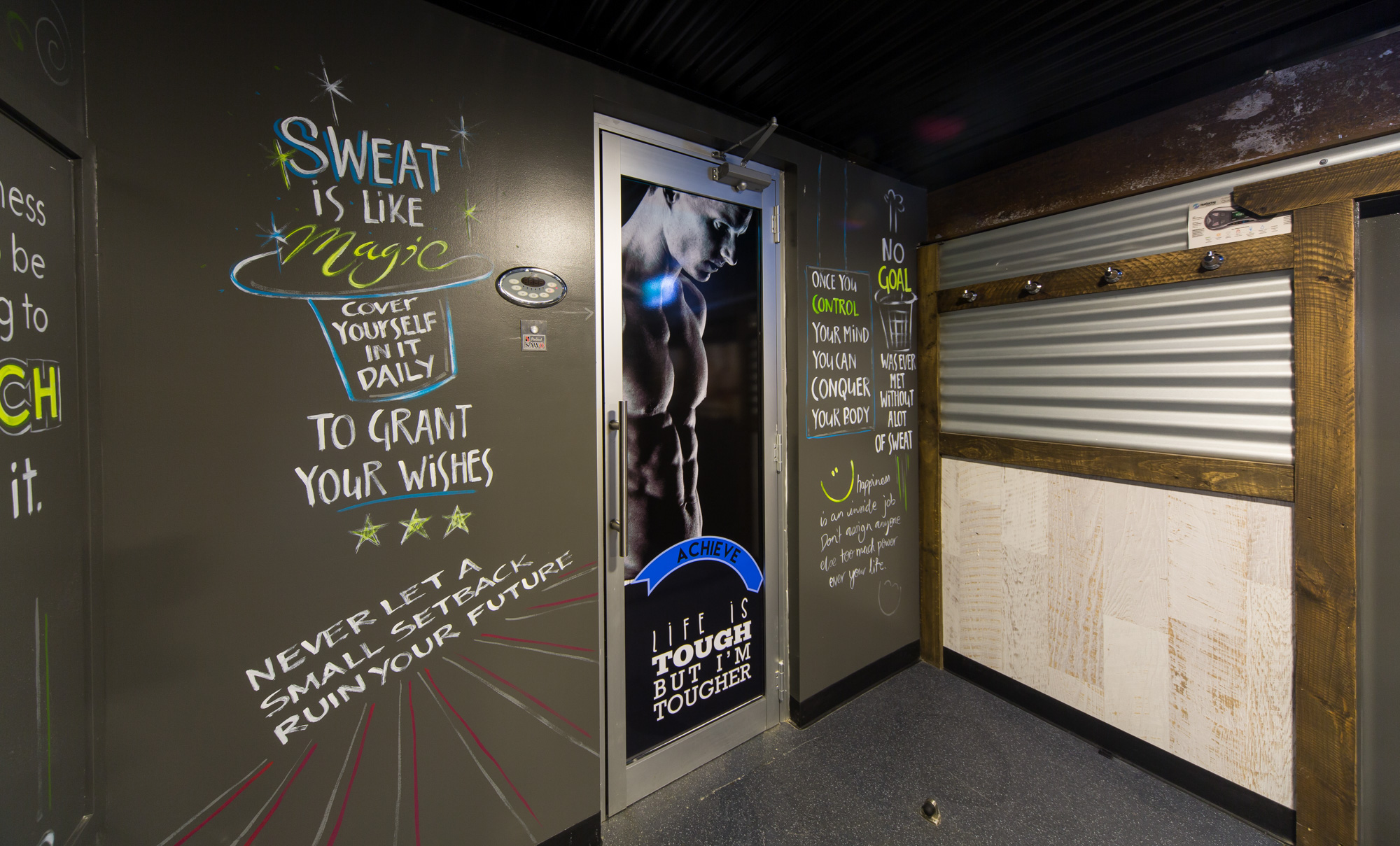
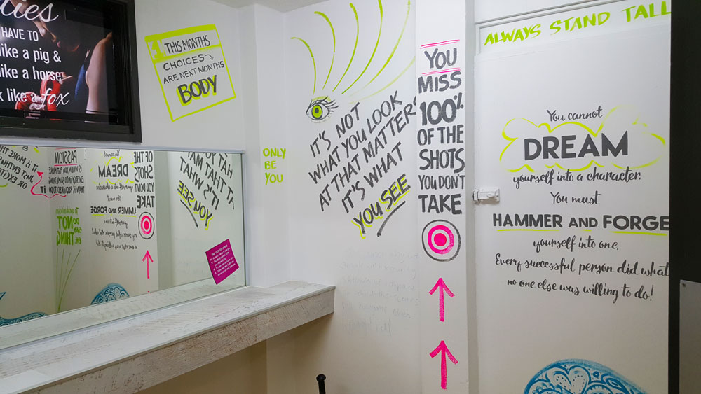
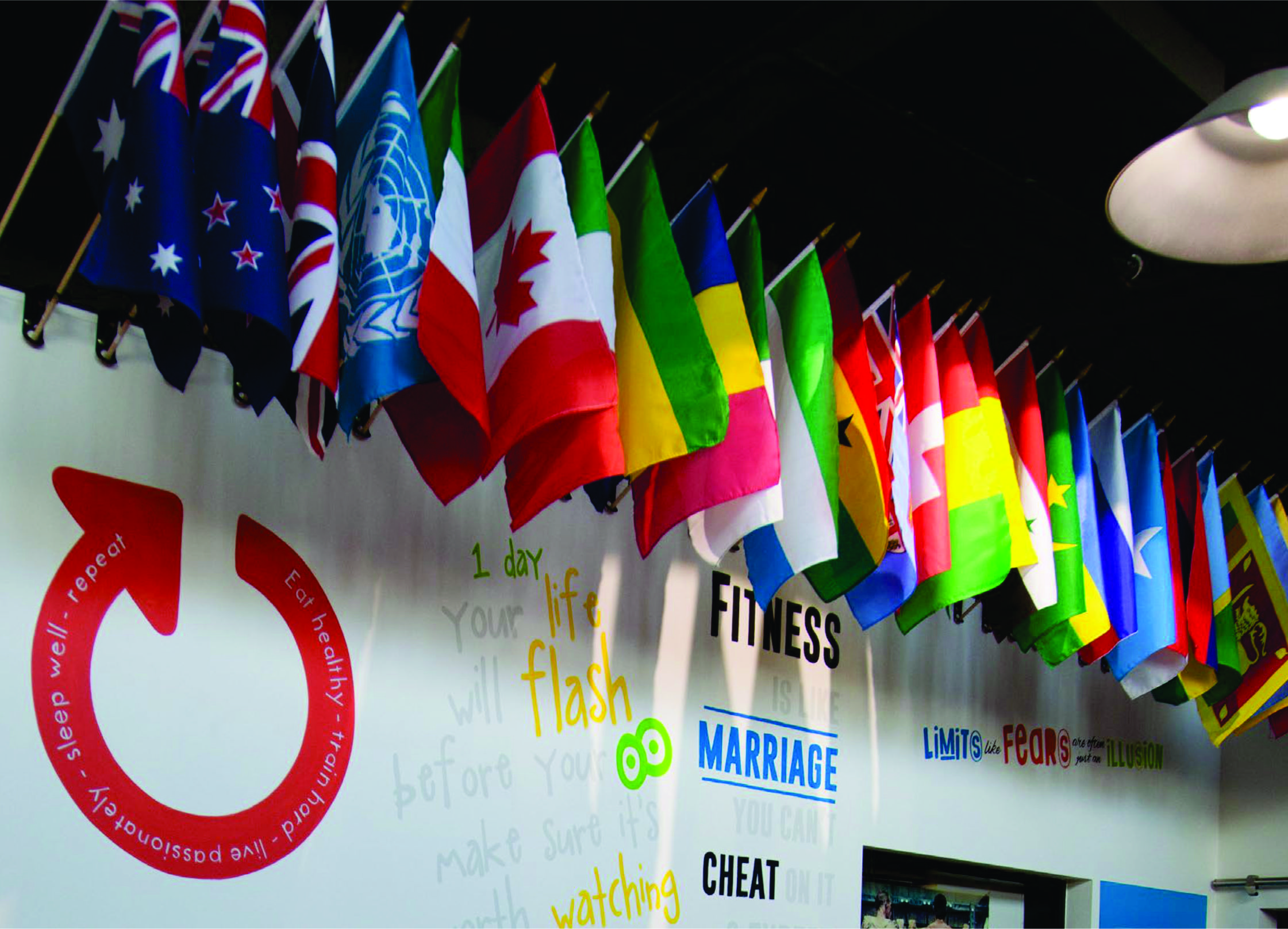
1000s of Hand painted affirmations on the walls driving you to keep going!

Bright fluorescent colours highlight certain words for greater impact a theme carried out throughout all the rooms.

Higher up on the shed the walls are filled with sports memorabilia from all different codes - it looks amazing


Logo design


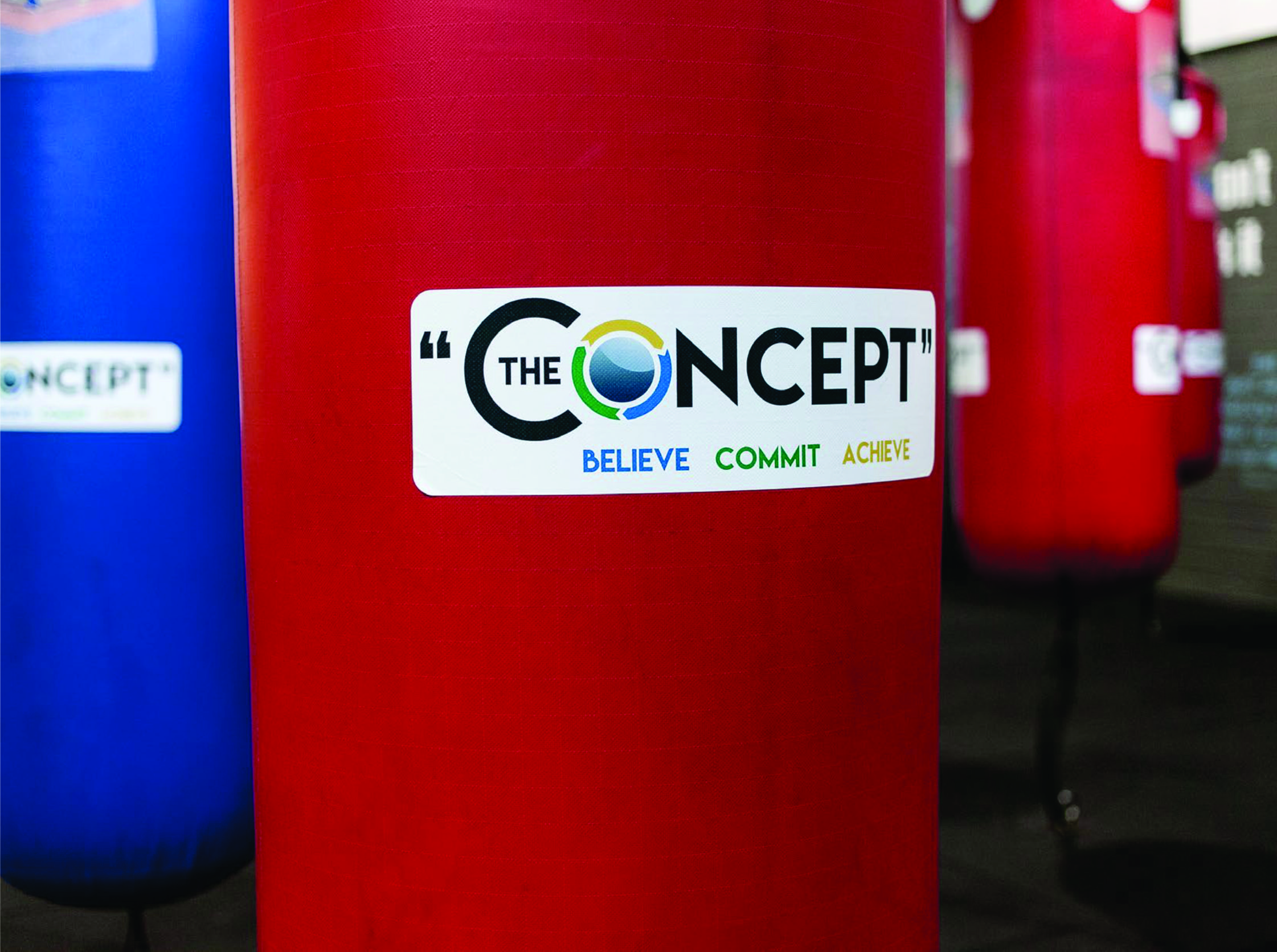
Josh Vincent tweeked the old logo and created a great brand for the new gym.

We branded the gym by clever placement of routed logos throughout the different spaces, adding more colour and life

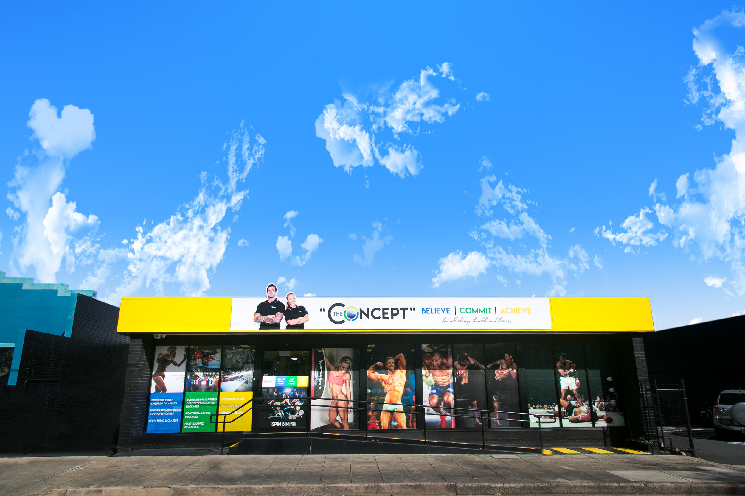
Energetic sports images and the gym's slogans were combined for the front entrance on the automatic doors, designed creatively for an impressive lasting impact.


Every angle holds a message


Looking up we even applied decals to the support beams and metal framework

Custom canvases were designed and manufactured along with large posters and small framed posters and decals for mirrors


Custom signs made for every surface


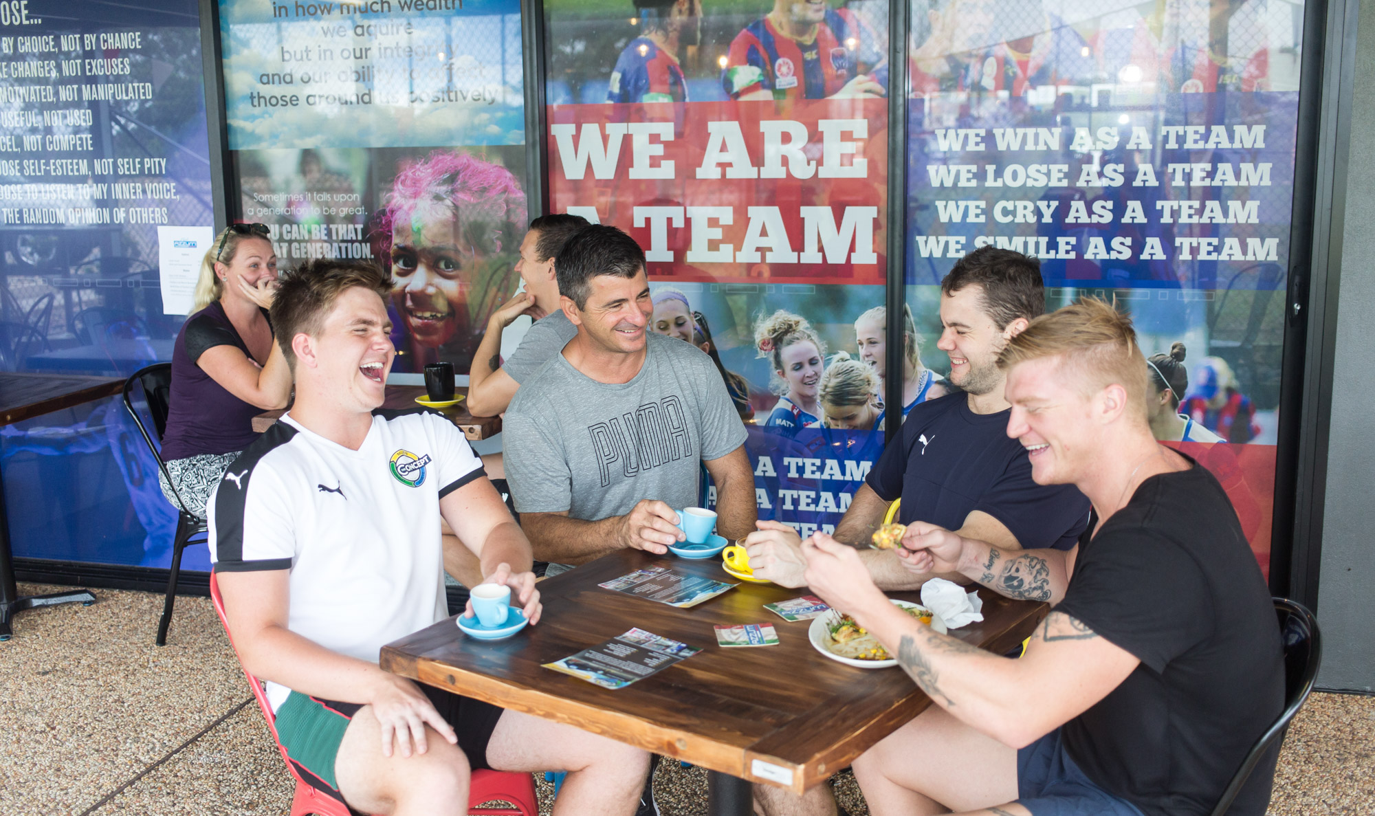
For impact and colour one way vision was cleverly designed and applied to the front main doorway and back entrance to the cafe.

Support for local sporting teams were featured here along with more affirmations based around sporting teams. So when the teams are practicing in the nets, or just passing by they can be inspired to strive for greatness.


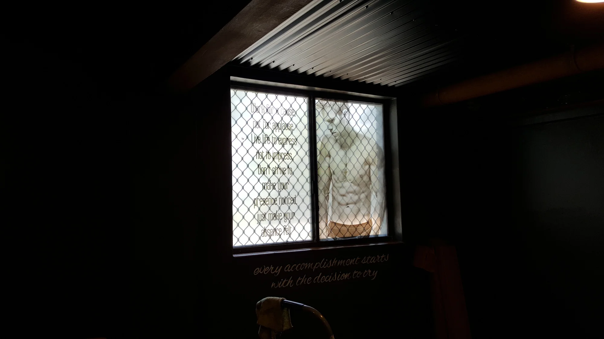
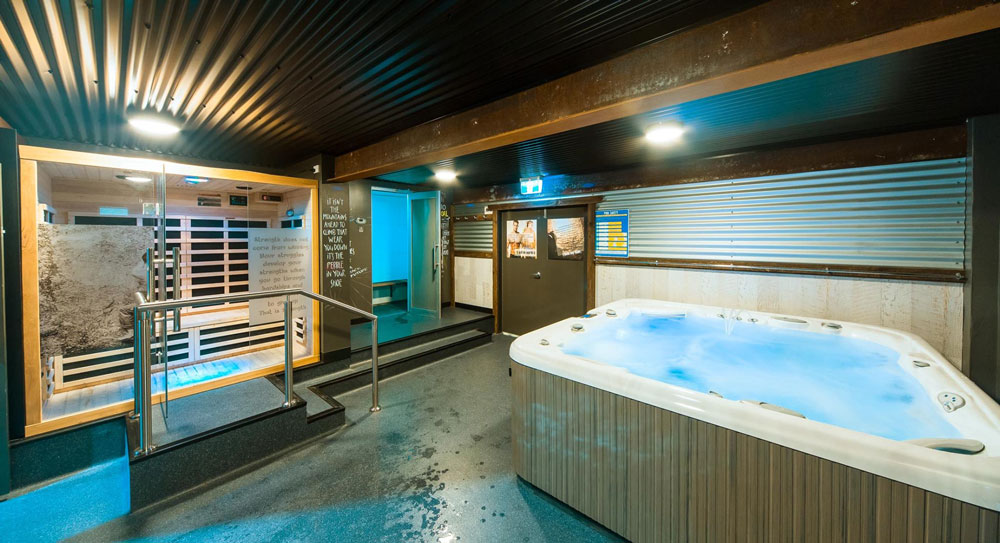
Privacy was established by using printed etching and printed images for doors and windows


Once again strong, powerful, uplifting images appropriate for the different rooms were applied throughout the gym such as the spa room below.

Every message used holds something personal for each individual.


The Concept Gym Newcastle packs a punch

The Think Team were at their best with this fitout at The Concept Gym.

There were so many interesting signs and displays that were custom made for the gym. From the moment you step out of your car you are met with the stunning figures and bright colours that just make you want to go inside and workout.

Here we achieved this great impact with the combination of one way vision, which allows light into the shop but you can see outside from the inside, fresh yellow and routed ACM sign for the main sign.

Step inside and it is just amazing!

Everywhere you look there are inspirational quotes and messages urging you to strive for your best and to keep going, never give up.


Walls, doors, windows even the equipment was used as a blank canvas.


Hand painted messages, posters, decals and canvases adorn the walls

Custom made canvases were made for the gym and hung, posters designed, decals laminating timber, punching bags or the lockers or even the toilet doors were applied. Each message was hand painted adding a personal touch, as if one of the members had drawn it themself.


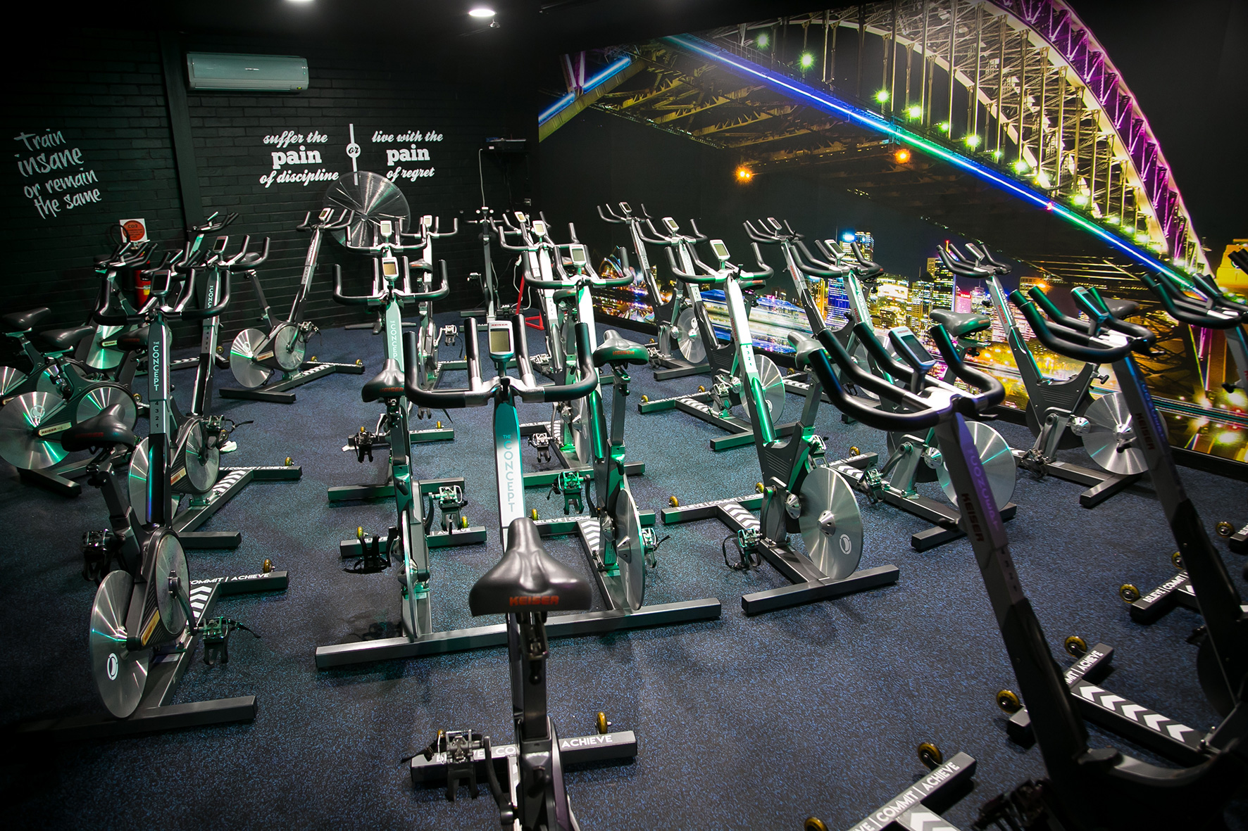
In the Spin Room the Sydney Harbour Bridge and more inspirational quotes on the walls illuminate once the lights go out and the music starts pumping

 
the concept illuminate hand painted sign think graphic communication.JPG

watch this glow

This is amazing to see


We are so proud of this job and it was such a lot of hard work but soo much fun especially because of the great crew that work at the gym and helped us in any way that they could.