Saretta Fielding Art and Design

Our team were fortunate to work again with Saretta Fielding Art & Design

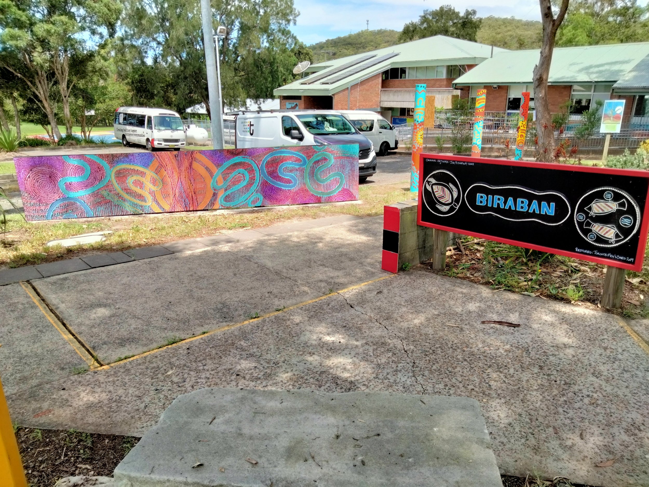
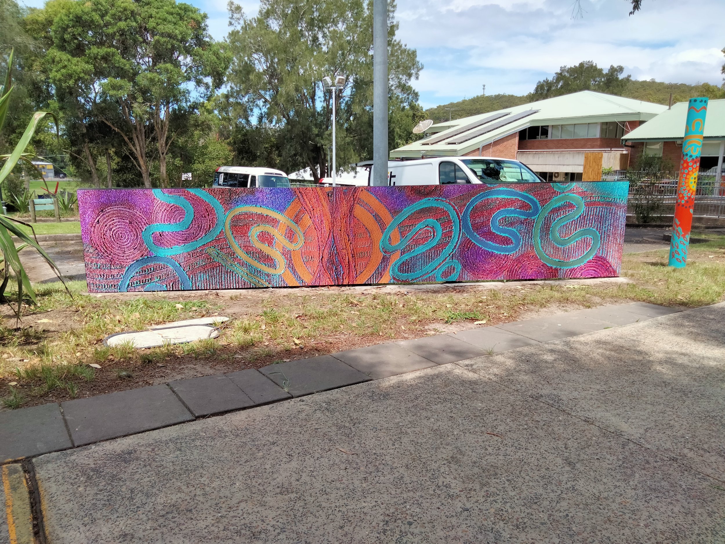
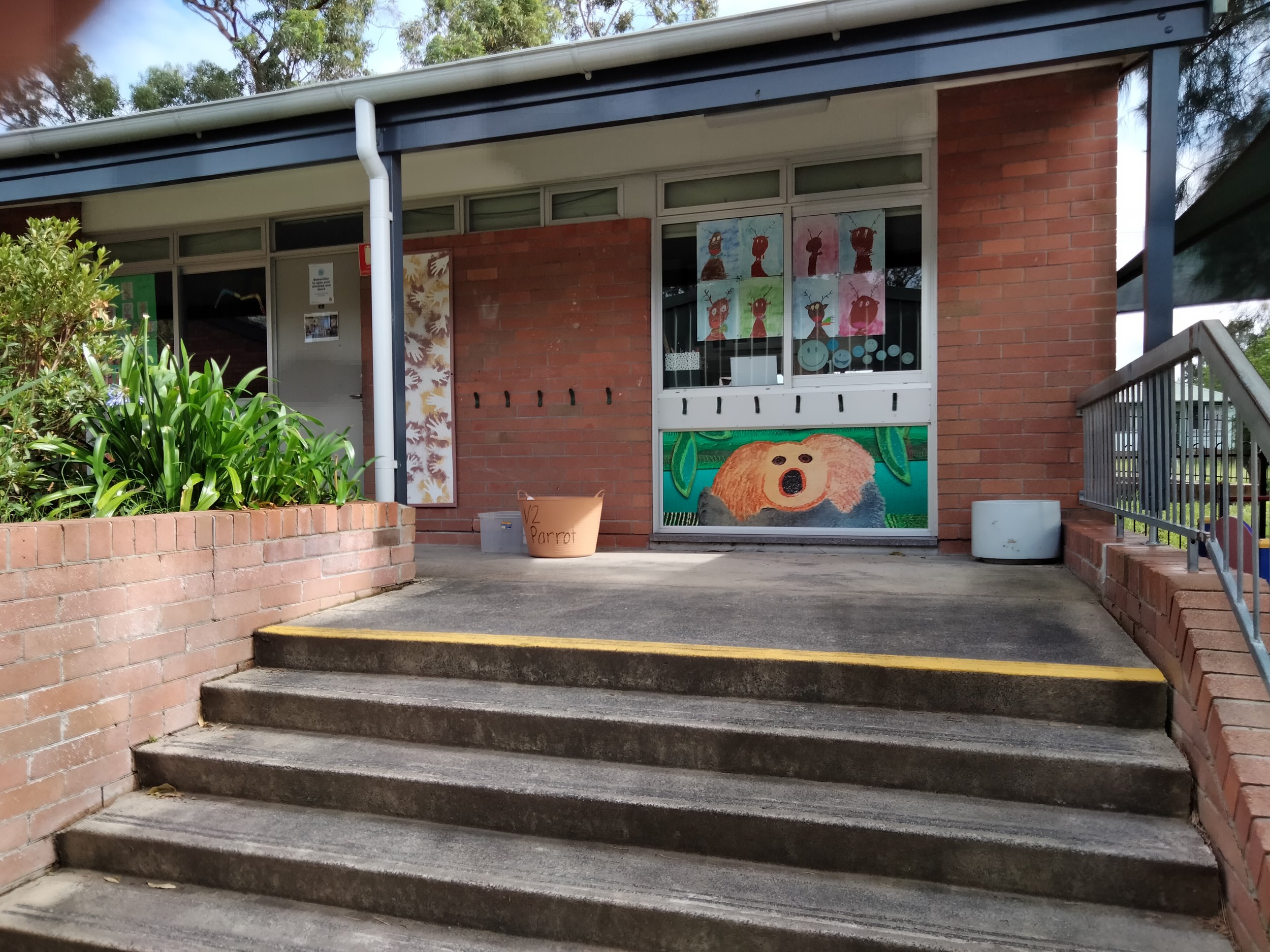
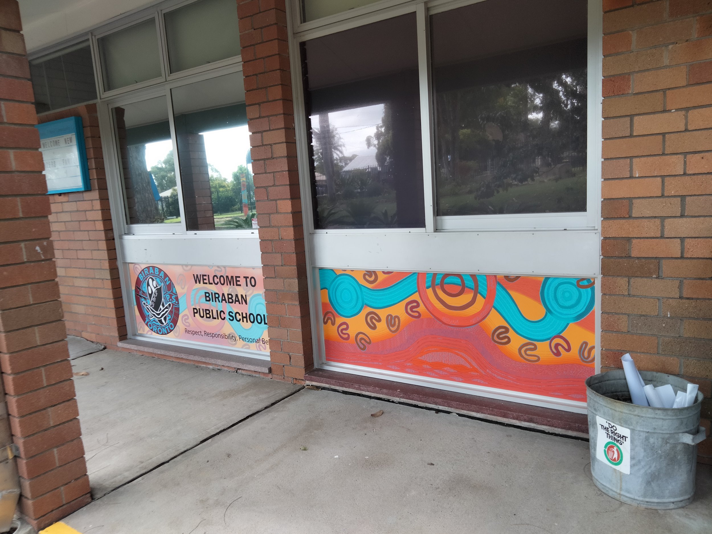
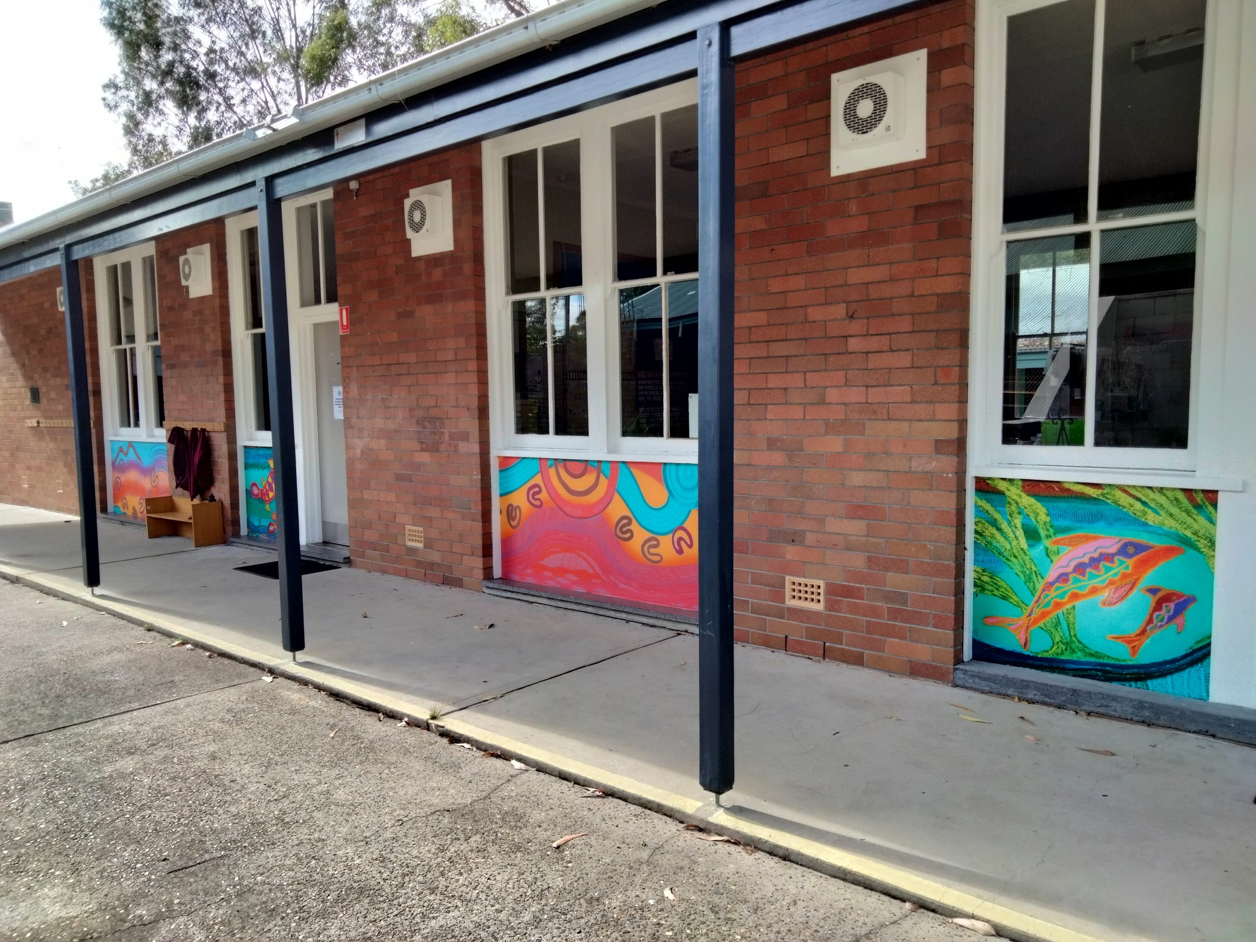
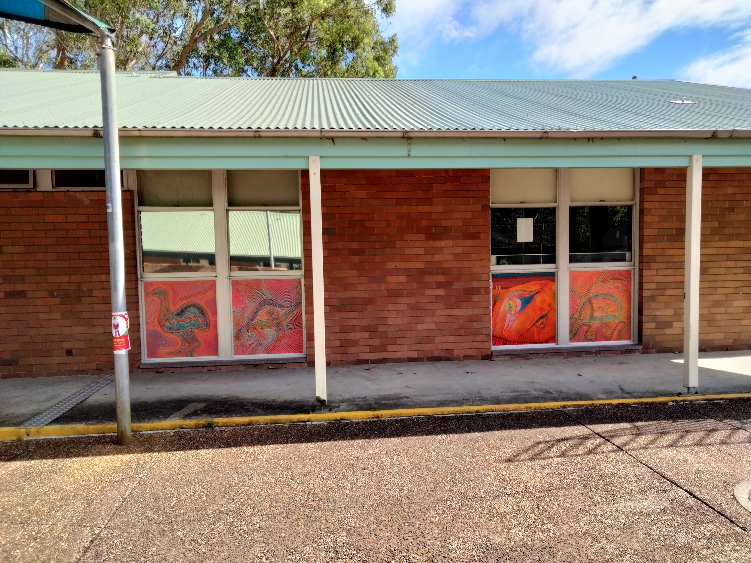
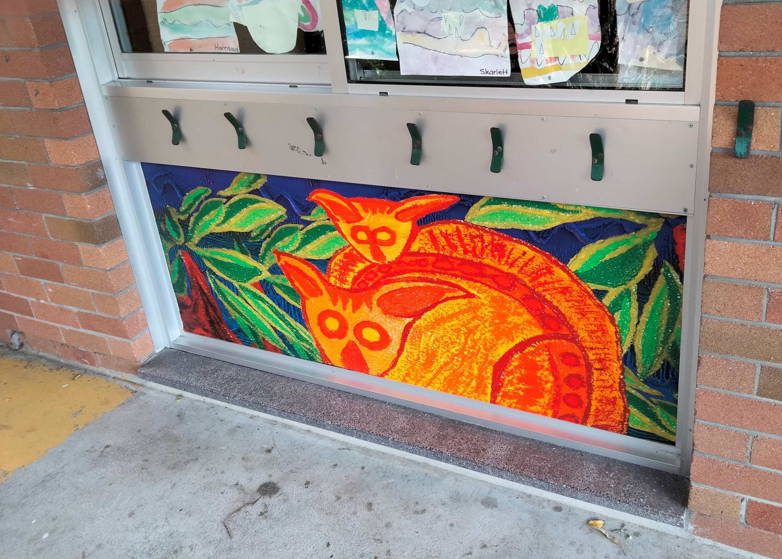
Working with John and Saretta is always a treat and this time we were lucky enough to supply and install some of her artwork at the UAA buildings in Newcastle and Biraban Primary School.

UAA interior privacy screens

We installed privacy screens in both of the offices for UAA. One using Hexis printable etch and the other on normal vinyl. They made such a difference to the room, bright, bold colours filled the walkways and created a feeling of warmth.

Biraban Primary School

At the school we installed these brilliant artworks on the bottom glass panels at the entrance of the school rooms. Not great on the knees but totally worth it once you look back and see these artworks filling the surroundings.

At the front entrance as you walk in, you are also greeted with another one of Saretta’s artworks. Once again the beautiful colours are so pleasing as you walk in and make it such a welcoming environment.


Saretta Fielding, Profile

Saretta Fielding, is a Wonnarua woman of the Upper Hunter Valley through her grandmother and an Anaiwan women of the New England area through her grandfather.

The land of the Wonnarua is located in the Hunter Valley of NSW and stretches from the Liverpool ranges in the north to Wollombi in the south and east from Sandy Hollow and Merriwa, across to the western fringes of the Barrington tops.

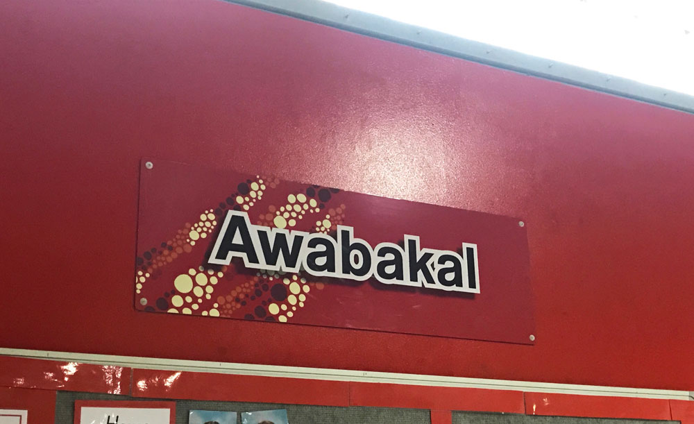
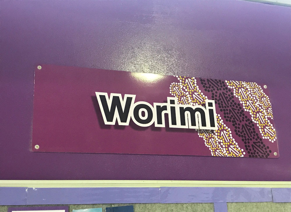
She has lived in NSW all her life and has strong connections across country, holding strong family and community ties throughout the state. Her connections link into Worimi, Awabakal and Darkinjung tribal groups, as she lives and works closely across our communities over many years.  Saretta has also worked across the State and Nationally both in Aboriginal Not for Profits .

Her love of culture, country and community are reflected within her work.  Saretta’s passion is to share her unique and invaluable culture through authentic, engaging and thought evoking fine artwork and visual design that welcomes all and enhances connection to spirit and country. 

Building connections to create initiatives in the arts that contribute to closing the gap is a high value for me.  I have been involved in reconciliation since it’s inception through Reconciliation Australia and see the ongoing benefit RAP brings as we share and gain understanding together.

My artworks are reflective in style to many traditional sand engravings found throughout Wonnarua country and the Hunter Region and are connected to country in style and design through the use of a sand based medium and engraving technique. The highly textured pieces embody the age-old sandstone engraved artworks created by our ancestors and add a unique dimension to the works..
— Saretta Fielding

Need to update or have you run out of space on your honour boards?

Think Graphic Communication are honoured to be able to produce your boards, and maintain the updates annually for your club or school.

think-graphic-communication-honour-boards.jpg

Honour Boards

Custom made to order


Custom made honour boards are like creating a beautiful piece of art to display on your walls.

The process takes time and patience with many steps having to be repeated in order to produce the perfect finish.


We can supply honour boards for clubs or schools, and offer you the option of using traditional hand painted gold leaf lettering, or vinyl cut lettering


Many think that the skill of hand painting is lost, but we can assure you that this is just a myth.

We are proud to be able to offer this technical skill as one of our many services to you.


Honour boards create a visual lasting legacy, so let us help you maintain or start, a club or school tradition.

After designing and installing your honour board, we can visit your location annually keeping your board updated and current.

Rapid Clean and wrapped

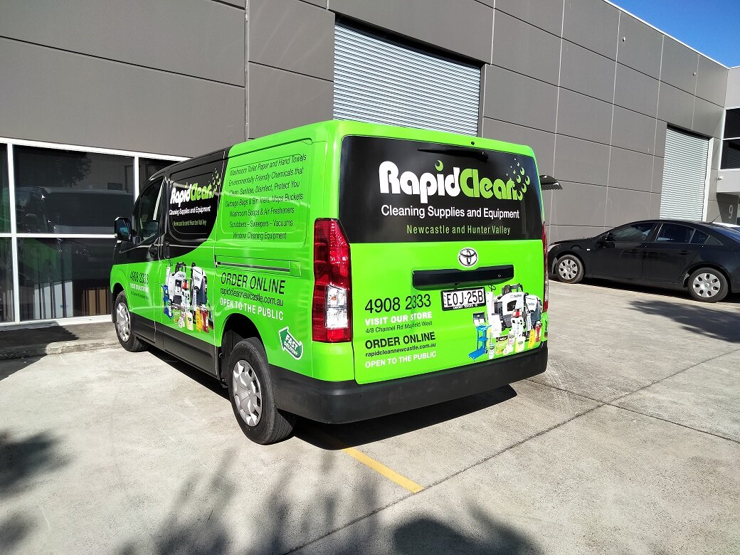
Rapid Clean have been busy wrapping their new fleet of vans.

VW Crafter Wrap

Firstly we got design and wrap the VW Crafter in the brilliant green.


Toyota Hiace Wrap

Then we had the new Hiace- the design was a little different fort his one. The frog got the boot.


Shopfront update

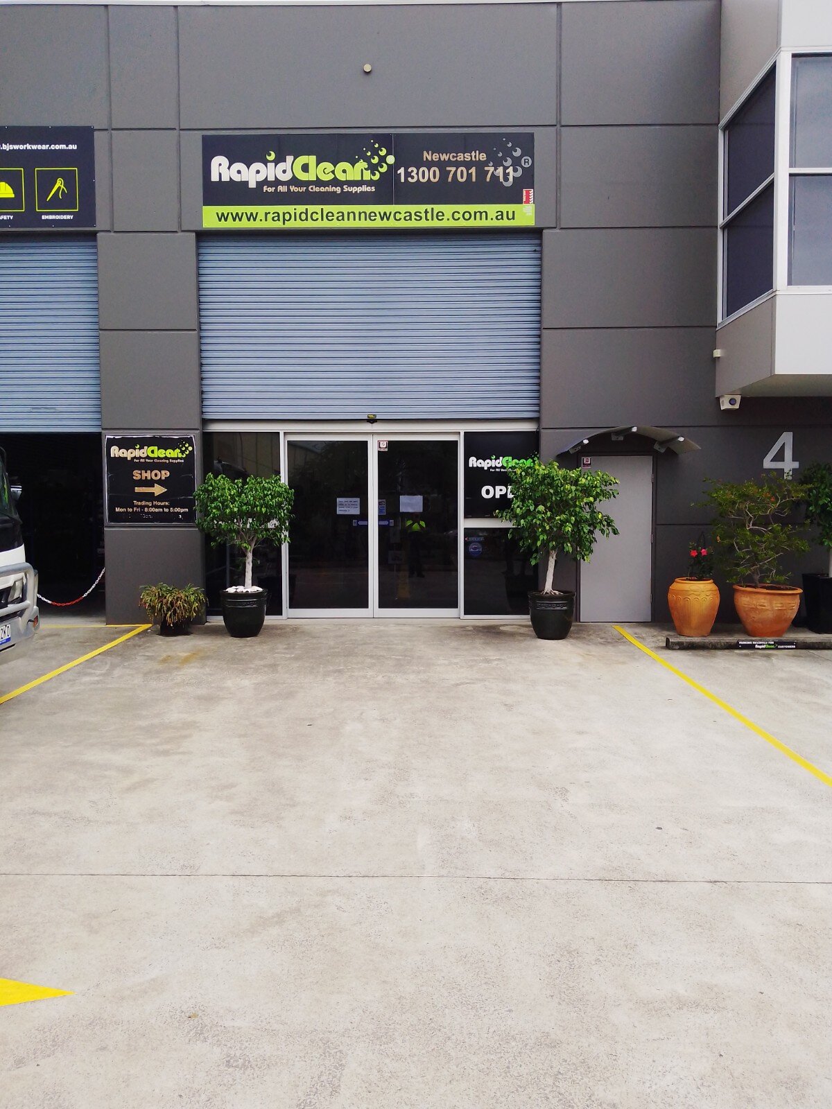
We even did a spring clean on the old signs for their shopfront. The vinyl had aged and was breaking down so we updated the colours and new logo.

Meet Ozzie Meats

Shortland is starting look good now Ozzie Meats have arrived.

Not only do they have the best signs but also only the freshest, finest quality meats.

ozzie meats shopfront TGC.jpg
 

Routed aluminium composite panels were supplied for the main awning signs and the shopfront was dressed with perforated vinyl graphics.

The logo brief was Ozzie flag, free style fonts mixed with new and traditional style layout. So many options.

Custom meat tickets were designed along with meat pack labels and promotional images.

 
ozzie meats logo stack rgb TGC.jpg
ozzie meats meat packs fb TGC.png
ozzie meats meat ticketsTGC.jpg

Meat tickets

Custom designed

Rev Fit Pumped and Sign Ready

Rev Fit launched their new gym in Tamworth recently and we were lucky enough to be part of it.

RevFit is a Functional Training Facility based in Tamworth NSW Australia.

rev fit team.jpg

Meet the crew

Revival - "an improvement in the condition, strength, or fortunes of someone or something."

Paul Lawrence - Owner / Coach

Paul brings a wealth of experience to the REVFIT team, having owned and operated a vast range of businesses with his most recent The Athletes Foot Tamworth. He has played and coached Rugby league sides across NSW, he loves the team’s aspect of REVFIT training. Paul is also a Qualified personal trainer who specialises in interval training and Thump Boxing sessions.

Paul has 2 kids Hannah and Bailey and has been married to his lovely wife Kirsty for nearly 20 years .

Bailey Lawrence - Student Trainer

Bailey is the youngest of the crew is super keen to continue in the Fitness industry through a REVFIT scholarship. He is currently studying year 10 at Farrer Agriculture School here in Tamworth. Bailey is very active playing both Cricket and Rugby Union at a high level. He is a very approachable lad, Bailey is always around for a helping hand and to push you to achieve your goals.

Ben Pearce - Coach

Ben has recently just completed his HSC and is currently studying teaching through Armidale UNE.

He is a avid Basketball player and coach, heavily involved in the local Tamworth Basketball community.

Ben currently has his Certificate 3 in Fitness and looking to add a Certificate 4 in Fitness in the very near future.

He is always up for a chat and enjoys spending time with the REVFIT members, helping them to achieve all their goals.

They have an amazing community at REVFIT!

If you’re feeling like your training has plateaued recently or if you’re just looking for something fresh, give them a call! They would love to show you more of what they do each day.

active kitchen’s signs

Have you seen the brilliant blue signs at Active Kitchens yet?

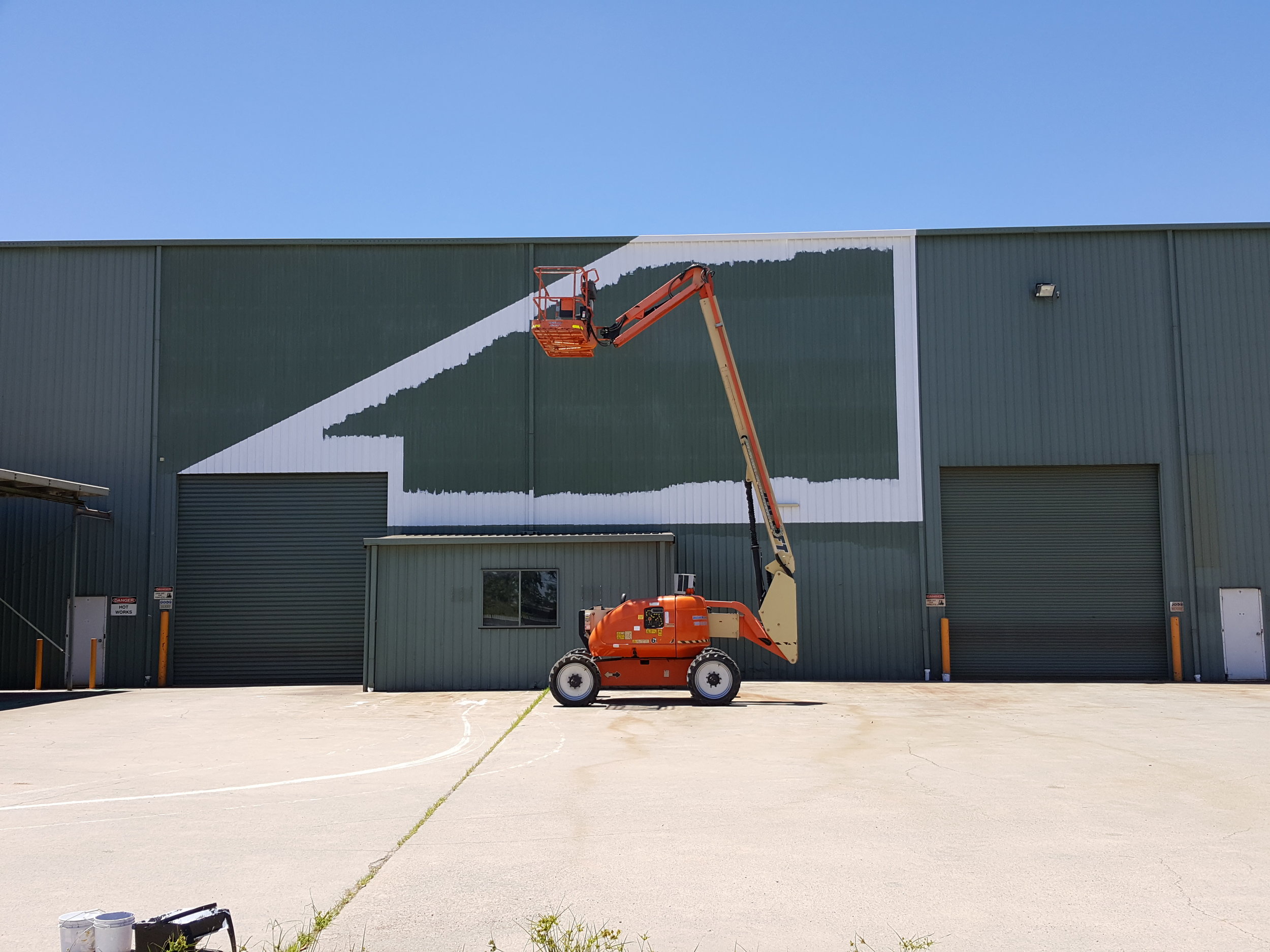
They look amazing! The blue triangular design really pops off the wall and hits you as you are driving up the road. Contrasting with the now grey not green it looks even better.


The transformation was awesome to watch


Now the building matches the rest of the moving billboards. As a set they look very impressive

CHRISTMAS 2020

LOOKING BACK TO THAT WONDERFUL TIME THAT IS CHRISTMAS- 2020!

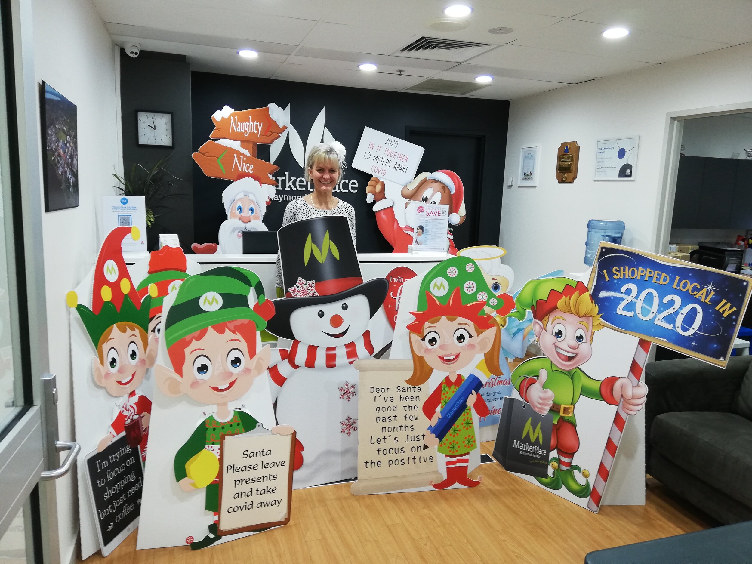
We love this time of year as we get to work with the wonderful crew at MarketPlace Raymond Terrace

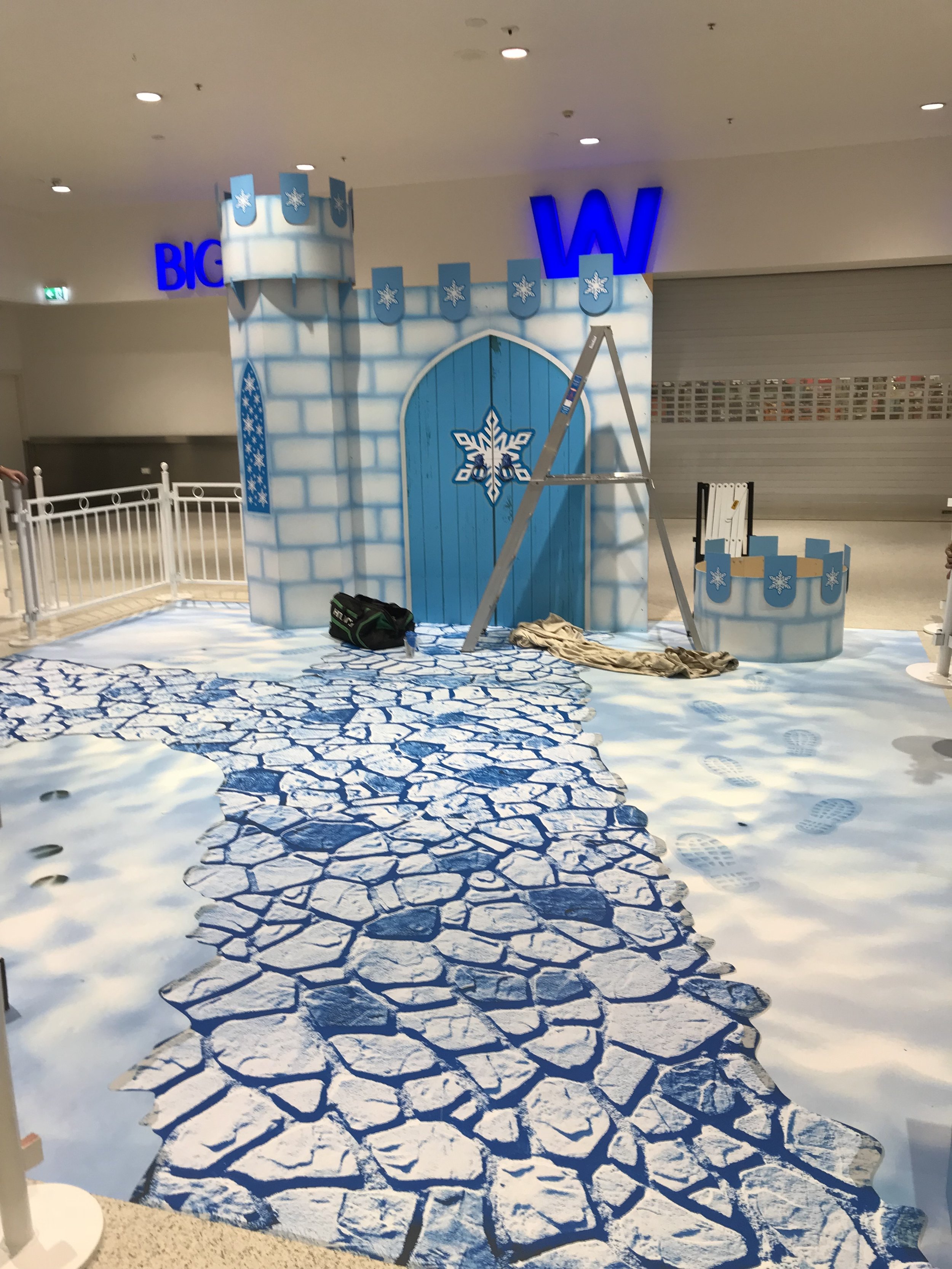
This year we had to revamp the icy castle - few touch ups- apply the floor decal, design an supply cutouts, covid floor decals and signs and of course Santa footprints.

christmas display 2020 market place raymond terrace TGC.jpg
christmas 2020 cutouts market place TGC.jpg
christmas floor graphic 2020 market place raymond terrace TGC.jpg

Cannot wait to see what we get to design for next year!!!

Quick Dash into Mount Hutton

Dunkley Dash Espresso Hut has a fresh new look!

We had the pleasure of working with the crew from Dunkley Dash sprucing up there shopfront.

packaging.JPG

Julie was great, she knew what she wanted and how it should look, made our job so much easier. Did i mention how good their coffee is!

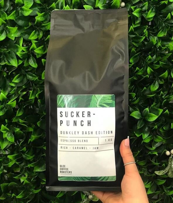
Our Design Team created their new presence. Fresh greens, contrasting against the stark crisp white and black. Those with a keen eye will see that the leaves are actually coffee plant leaves, appropriate we thought. The log was inspired from their new look coffee bag labels


Dunkley Dash pre make over.jpeg

old look

Pre makeover

Dunkley Dash post make over.jpg

new look

little bit of magic

New sign panels were designed and installed on the side of the building replacing the single sign panel. This has great street view frontage as you are coming down the hill. A little of personality was added with the quote on the second panel, after all coffee is all about warmth and getting that good feeling.


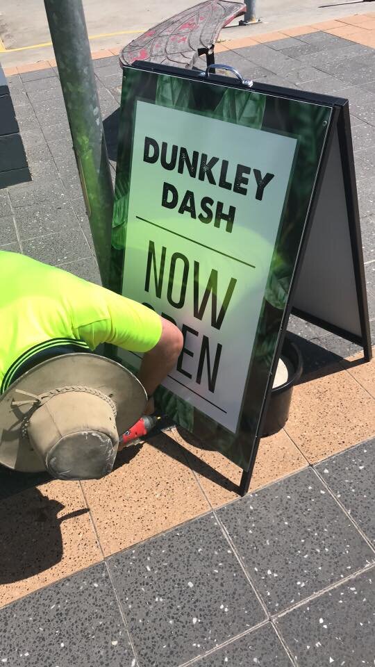
Add an a-frame fresh’n up - couple of new sign panels, and trading hours decal on the window installed and the look is complete.

With Breast Cancer Awareness Month being so dear to Julie, we also made some t-shirts and a posters for her campaign.


Dunkley Dash breast cancer tshirts.jpg

Breast Cancer Ts

Custom designed shirts for the lovely ladies

Chanelle & the team have been nothing short of fantastic, we couldn’t be more happier with our new signage for Dunkley Dash thank you so much guys
— Julie Roach

Chilly Christmas at Marketplace Raymond Terrace

Santa made it to Raymond Terrace Marketplace

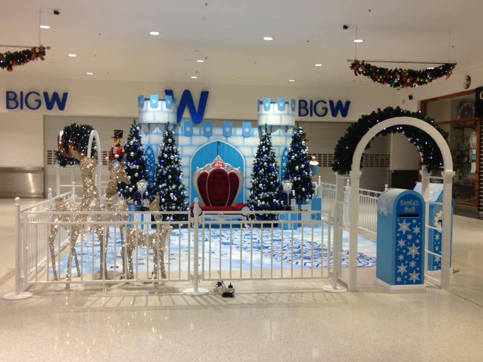
We thought we would share some photos of the fantastic Christmas display we created Christmas 2018. It was truly a magical job to create.


Almost everything on display here we painted.

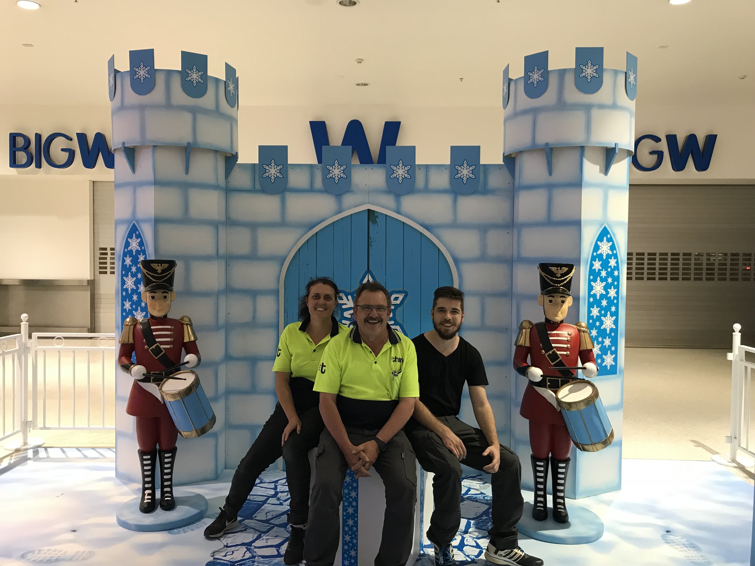
The castle was sprayed icy blues, Toy soldiers patched and resprayed, Gift boxes painted and wrapped with custom designed ribbons.


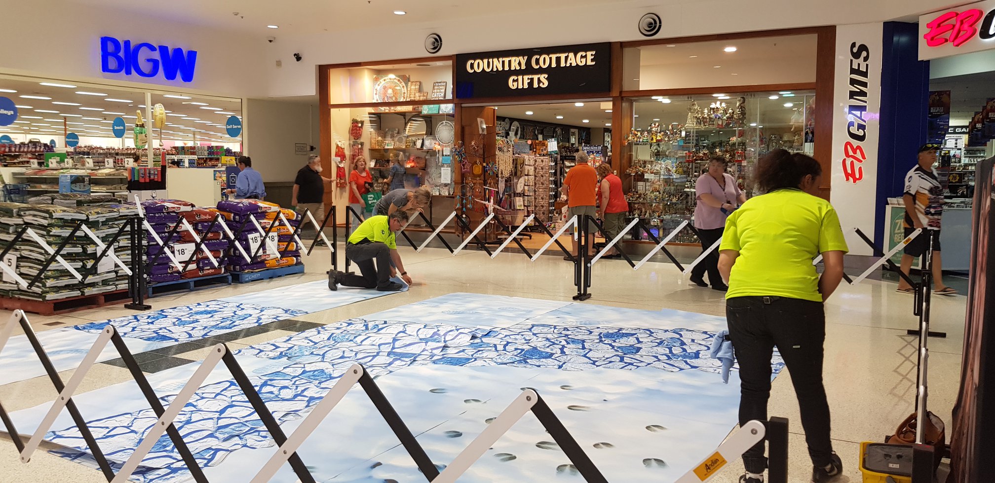
Paving the way to Santa

The magical pebble path to Santa was laid in that fantastic fairy hour when no-one knows how or when it actually happens. Even the reindeers and birds got their imprints in the snow

Near the archway was a letterbox direct to Santa which was also painted to suit the cold, snowy blue theme and a clock to match.


It was a massive job designing, creating and installing the masterpiece but totally worth it.

Merry Christmas in July!


Bis Industries bright and bold

Bis hand painted signs look amazing

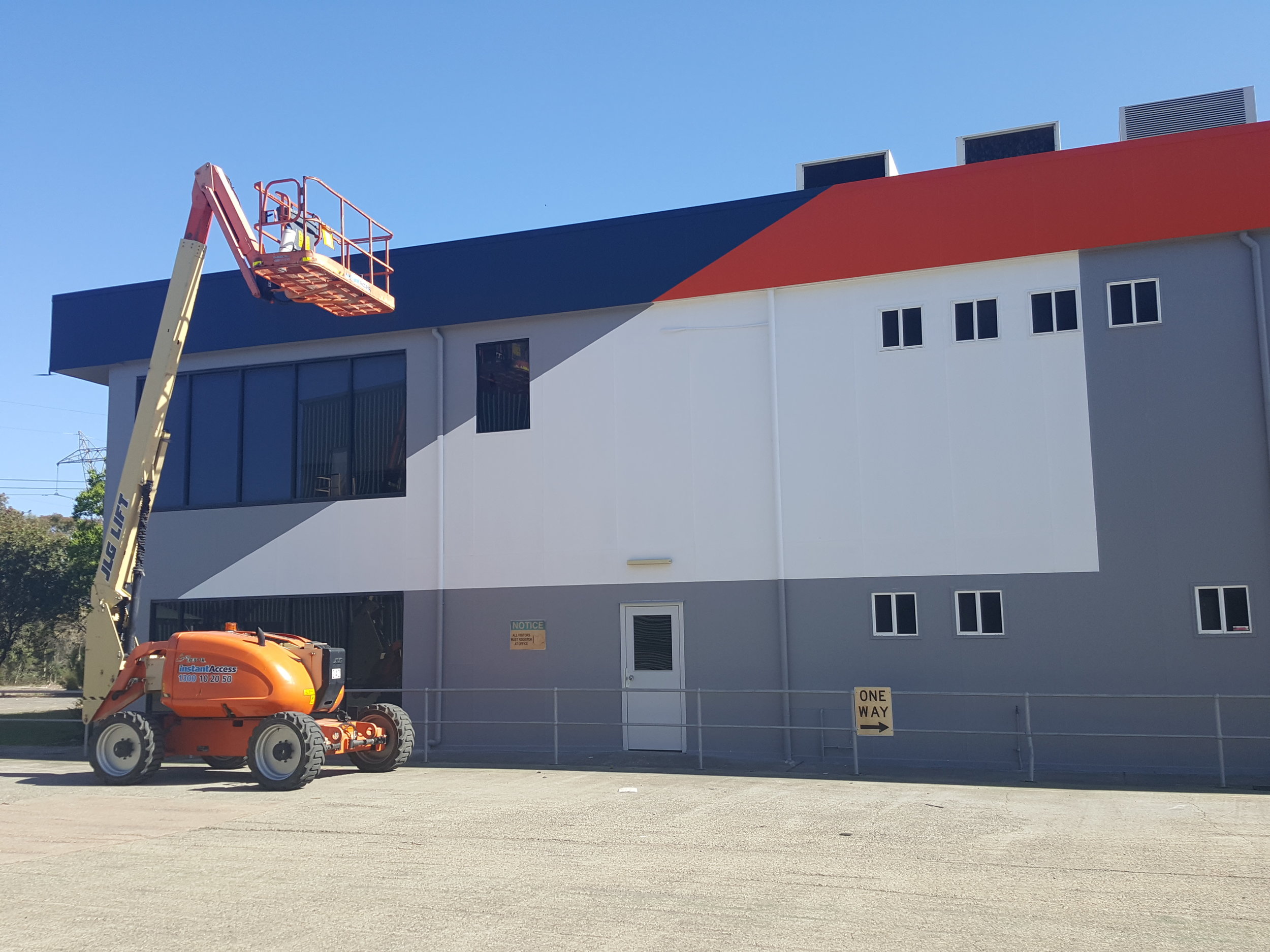
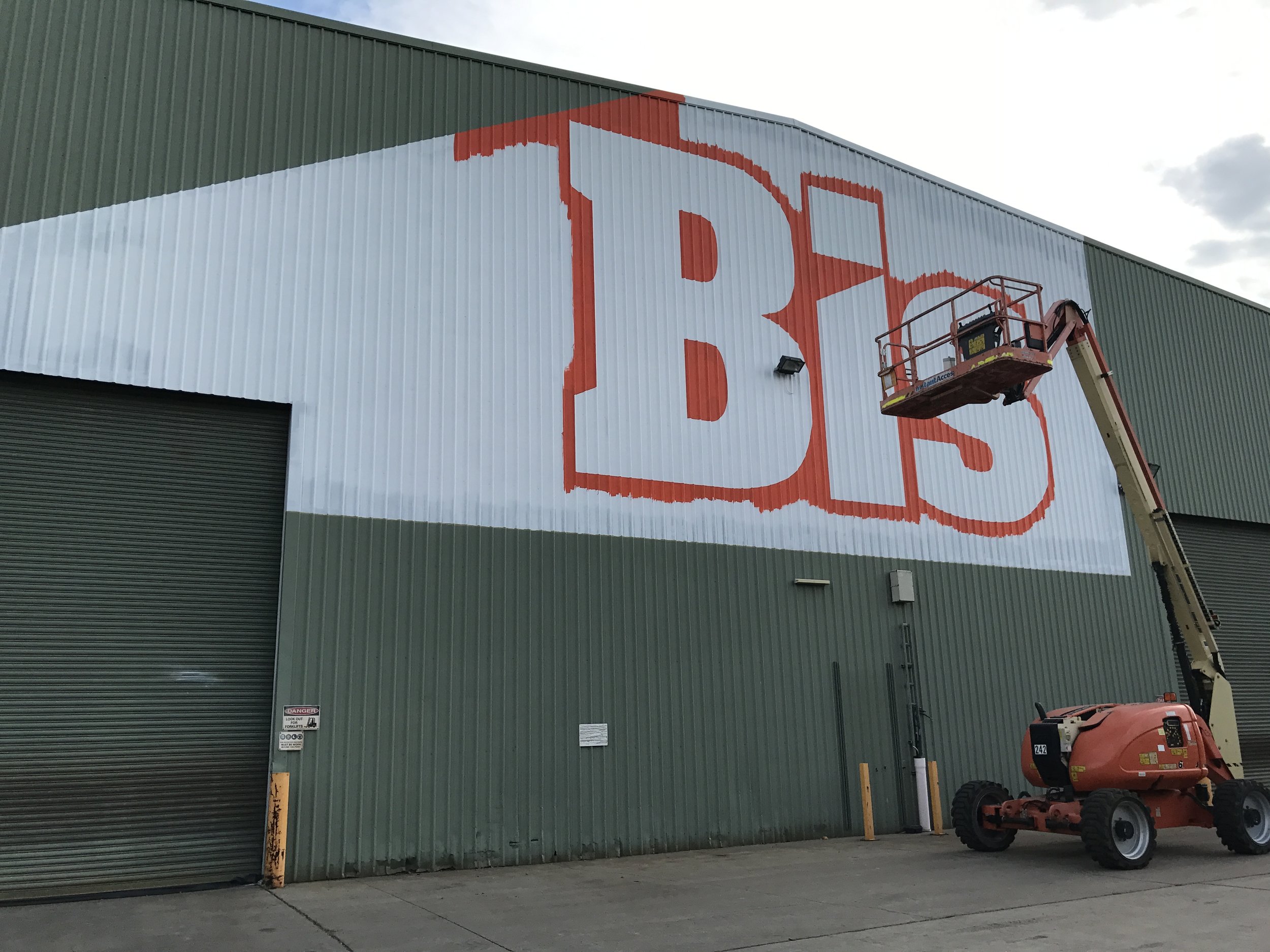
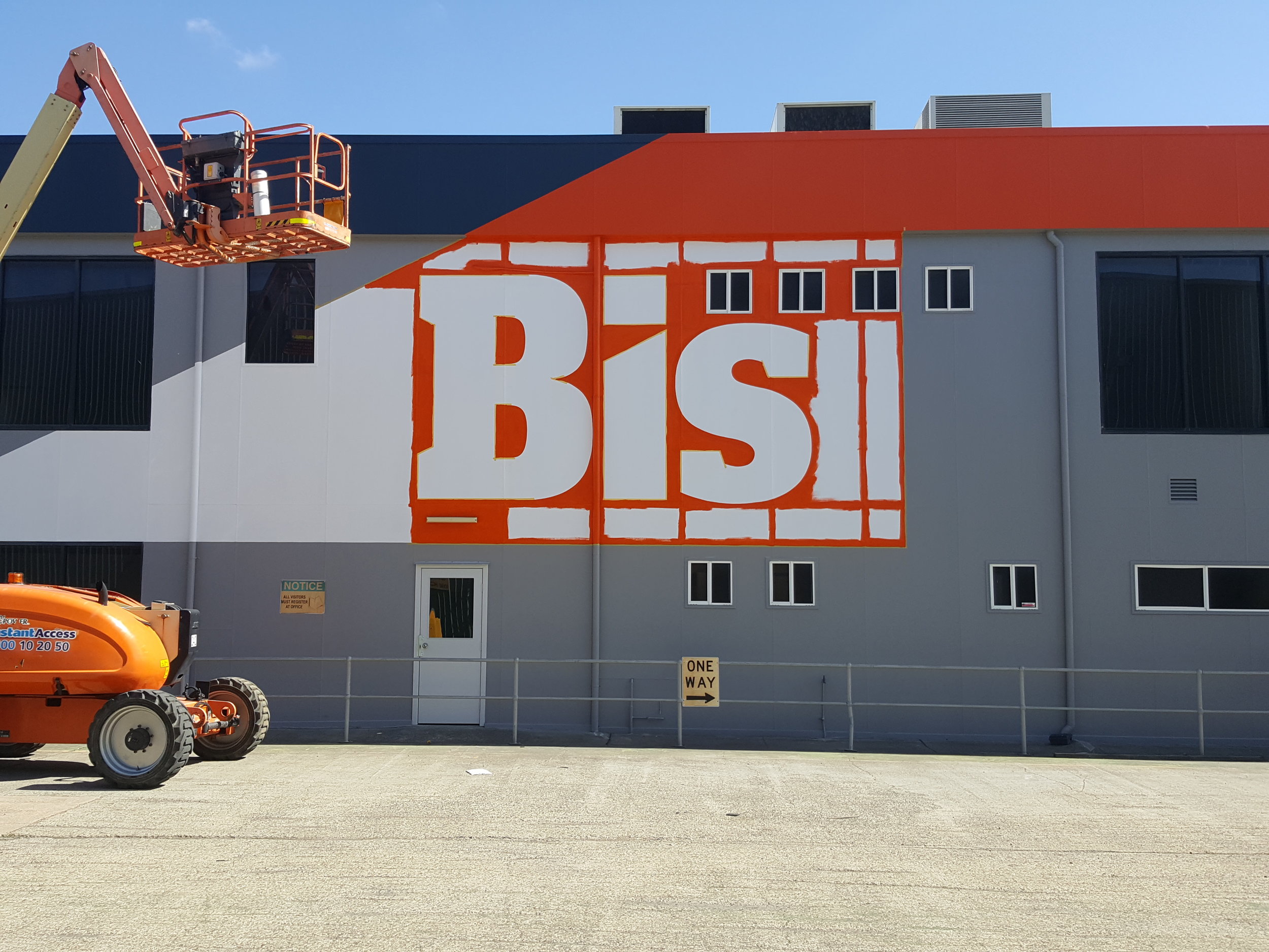
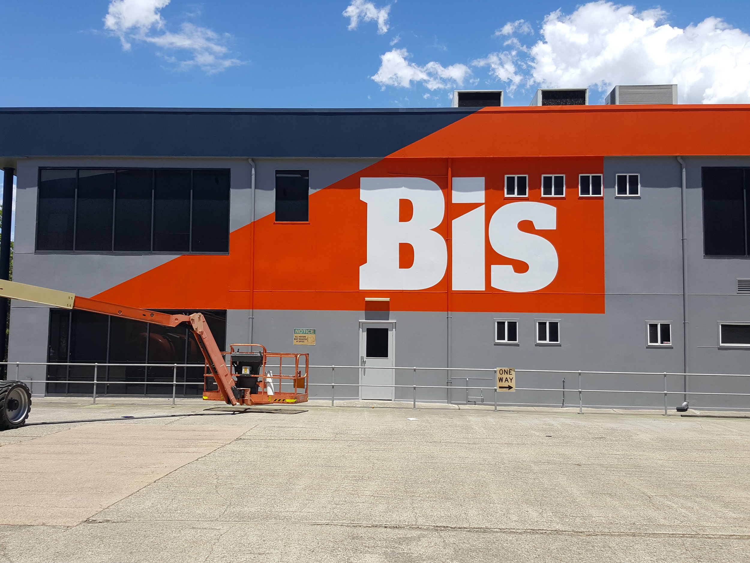
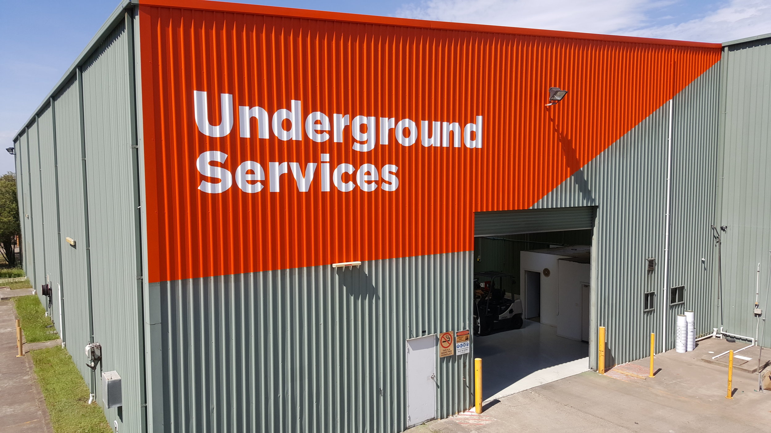
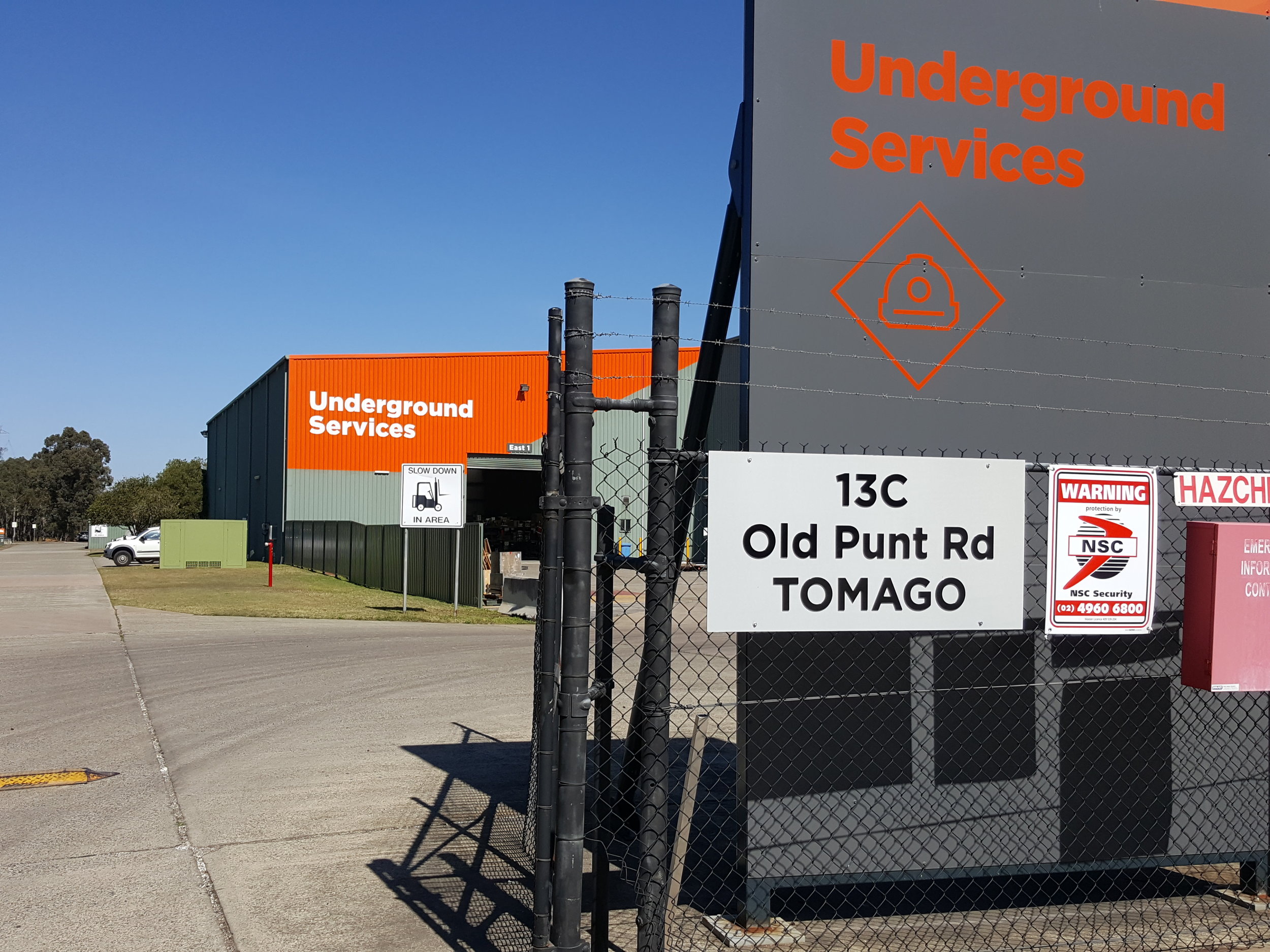
Bis Industries moved into 606-608 Tomago Road, so of course they needed some signs. Boy they were large signs - some were 6000mm tall and 10500mm long!

For a sign this large and the surface they were to be installed we didn’t hesitate to put on our painting pants and hand paint the signs directly to the corrugated walls. So with airless spray gun in hand we set out preparing the walls for the signs. Each sign had to undercoated, orange base and then the lettering marked out in white.

20171204_125435.jpg

rain or shine

From extreme heat to pouring rain, the weather didn’t stop us from painting these enormous signs

These signs at Bis were enormous as you can tell from the size of this bucket compared to the sign

think graphic communication  Bis signs wall graphic.jpg

wall graphic prints

these were very impressive

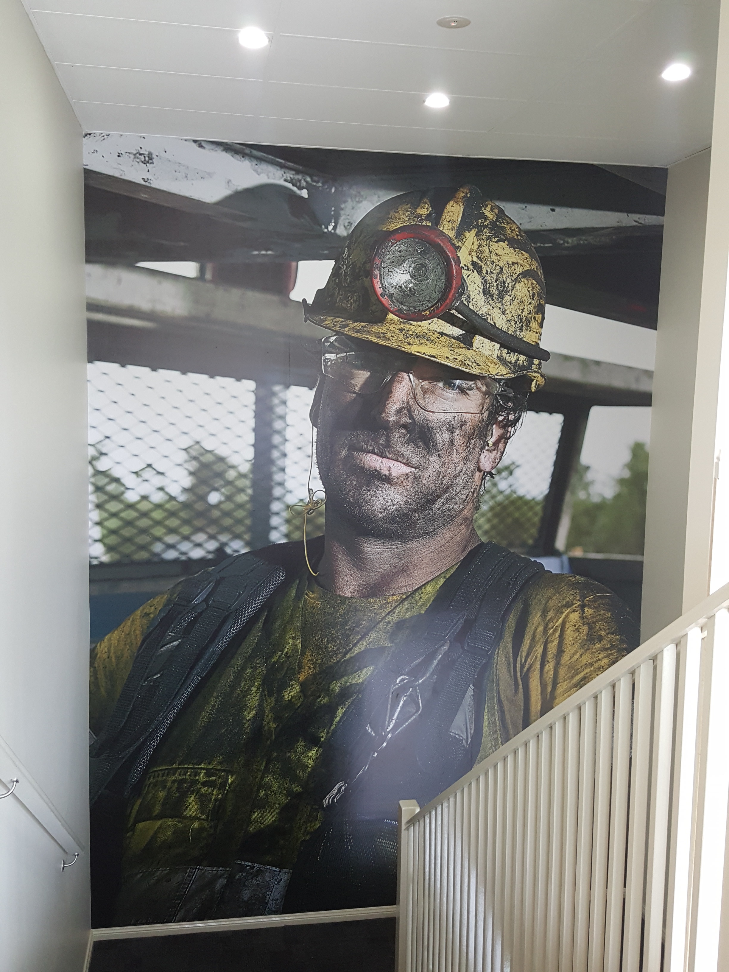
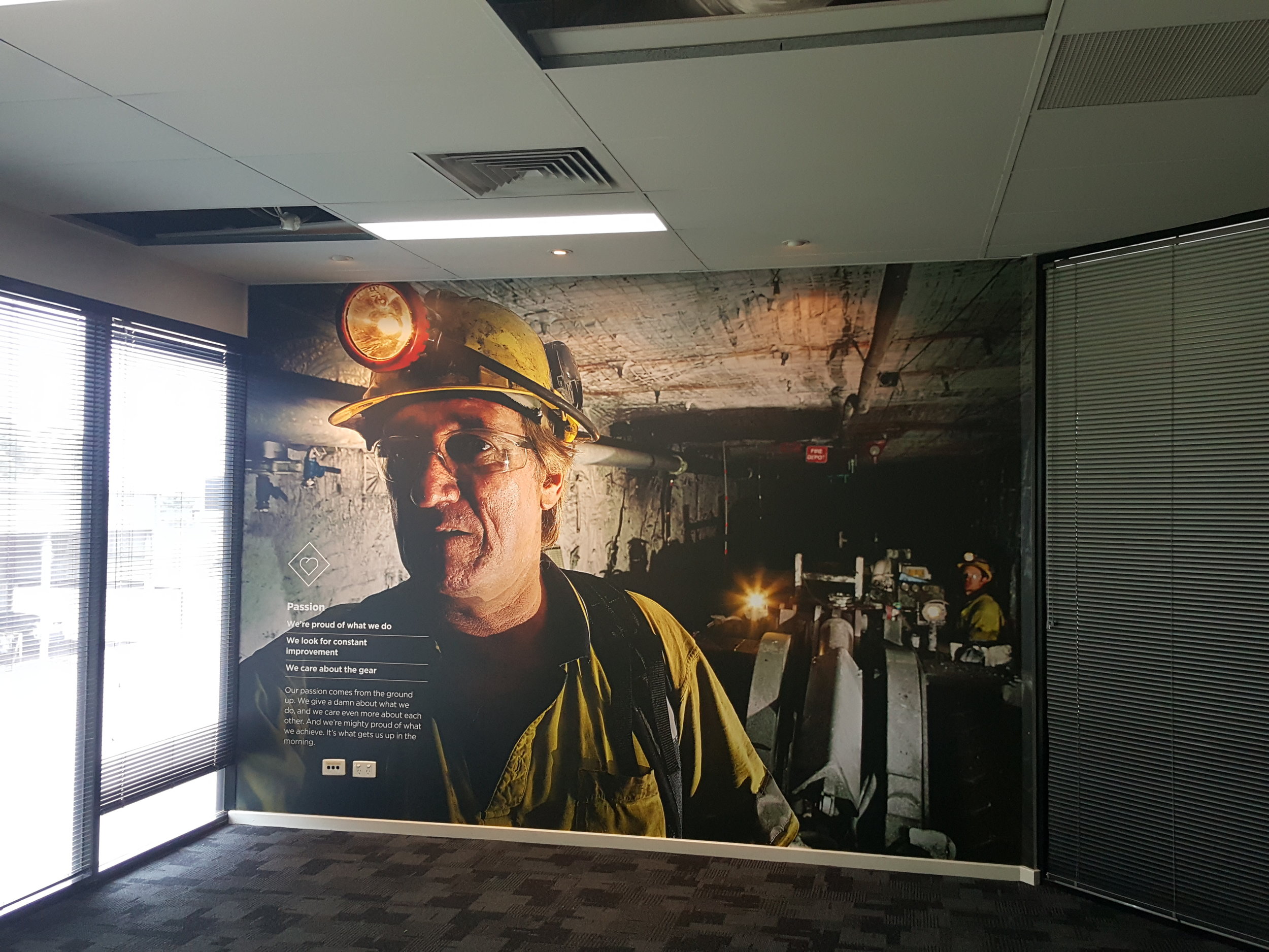
We applied large wall graphics to the main stairway entrance and the training room wall. Using Avery wall graphic media we prepared the walls first with a primer and sanding.

The images were supplied by Bis were honest, dirty images of real employees - capturing the harshness and grit of their industry


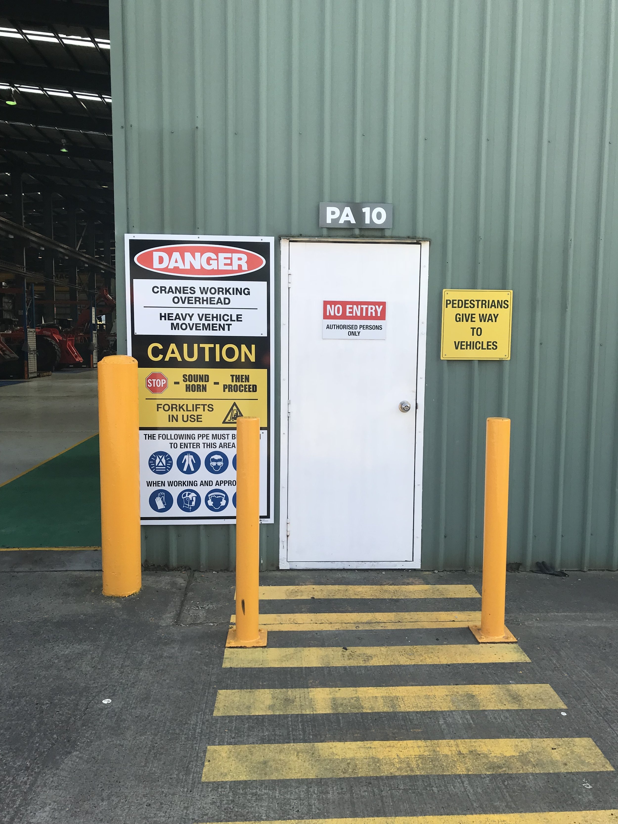
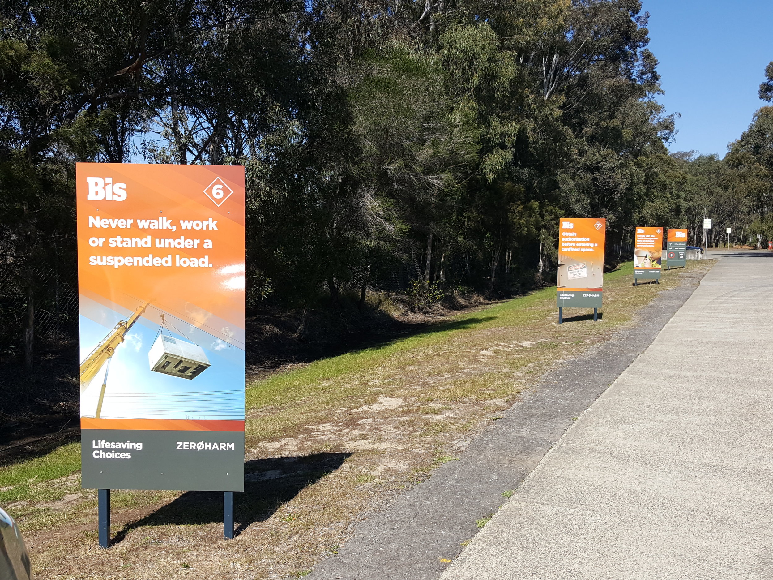
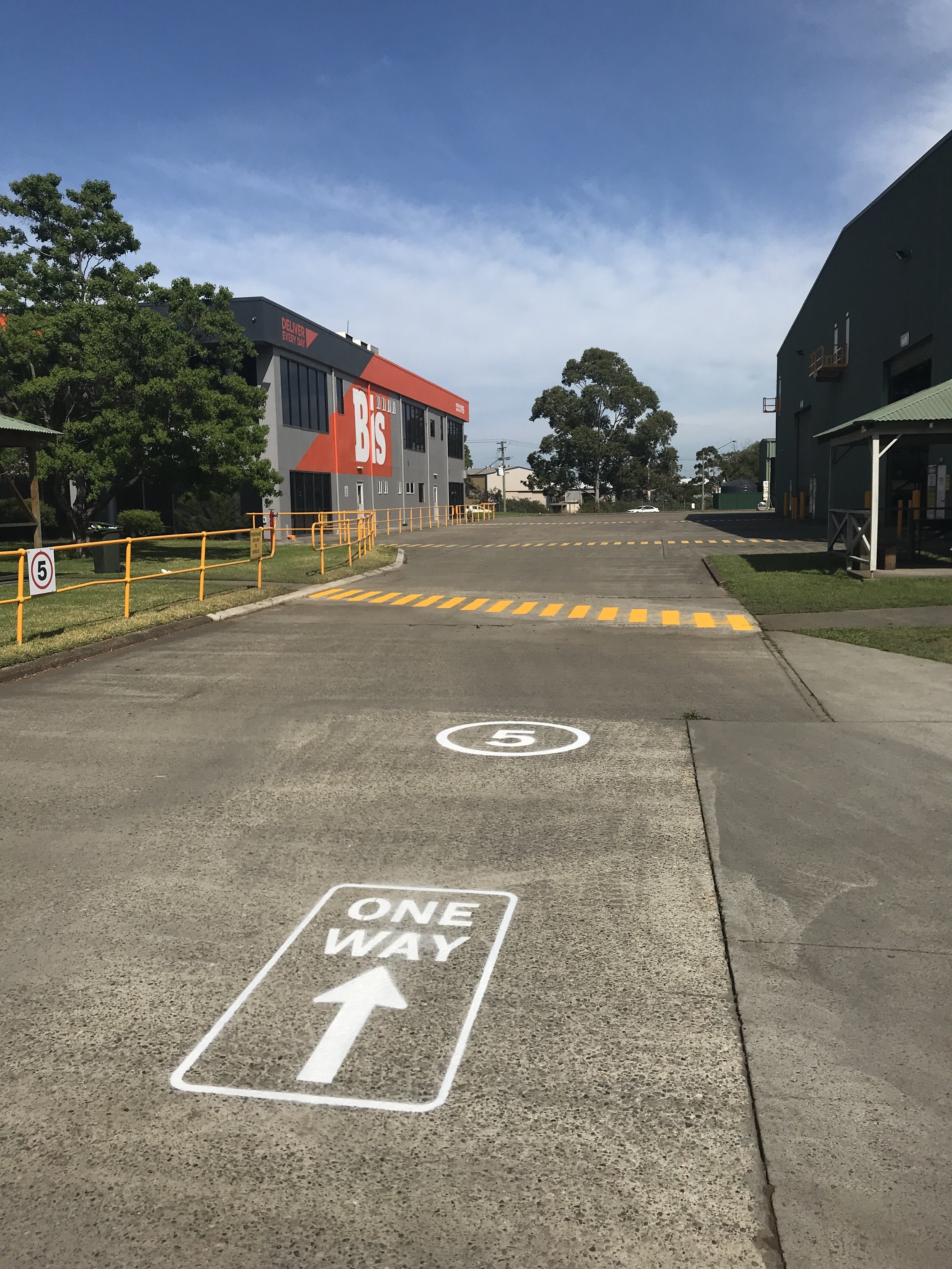
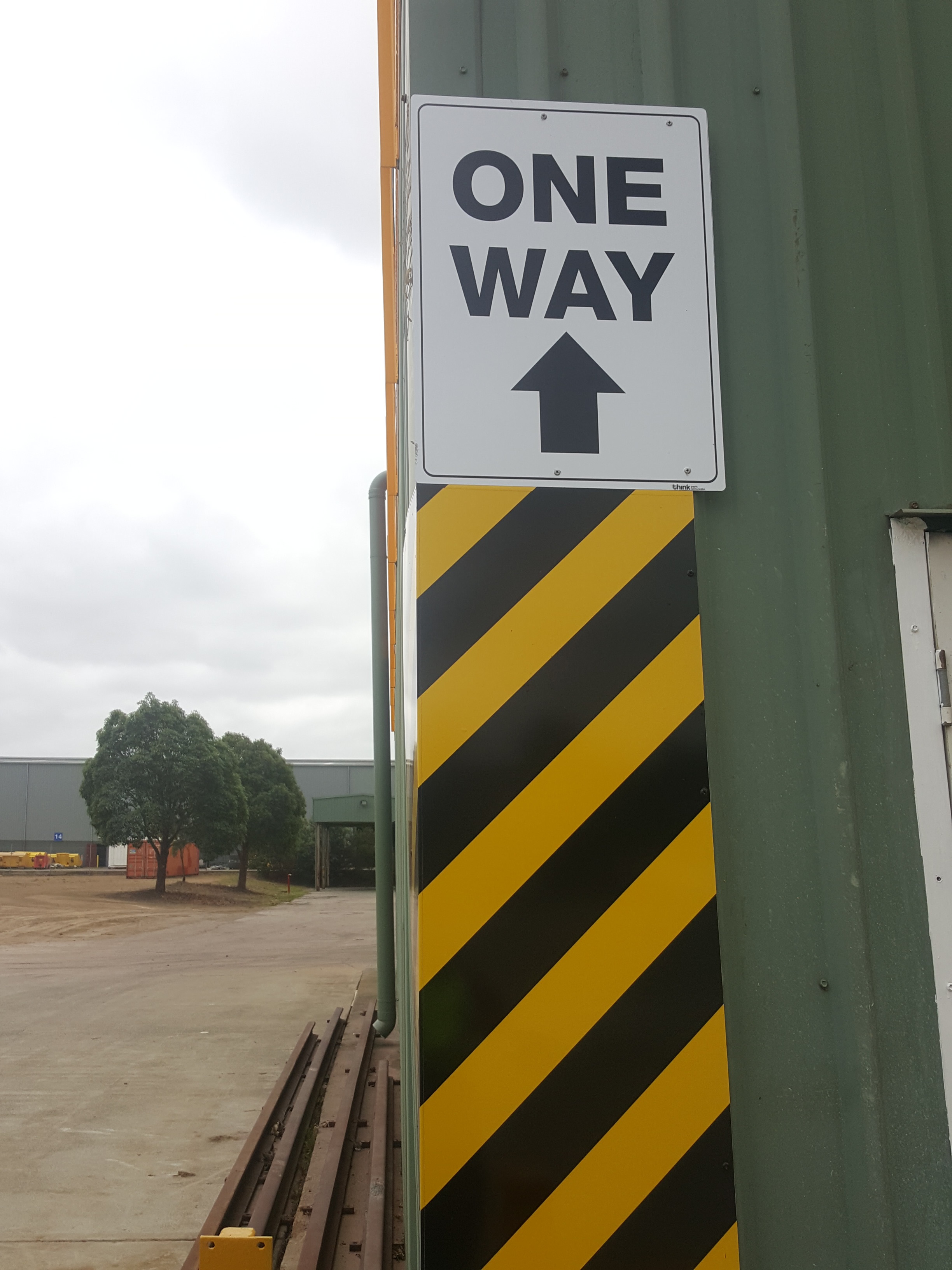
Custom safety signs were installed around the premises as well as road markings and truck parking bays


We have been delivering every day for our resources customers since 1915. Bis provides the logistics, materials handling and specialised equipment you need to efficiently haul, transport, handle, process and deliver all your commodities. Our people find the best solutions and inventive ways to drive productivity improvements in your supply chain. You can count on our staying power and industry leading safety record. With Bis, you can Deliver Every Day.


Crema Coffee Garage hoisted

Royce had a great time up in sunny Queensland branding Crema Coffee’s new premises.

The front facade was laminated with one way vision vinyl designed by the Crema’s fantastic design team. This acted as both informative, decorative and added some much needed shade for the showroom. Out the front in their lovely new pruned garden, a street sign was erected towering over the hedge - great for traffic exposure.


We love their branding so clean and simple and their Pegasus is so easily recognisable.


crema coffee garage great coffee.jpg
crema coffee garage queensland front.jpg
crema-coffee-garage-queensland-one-way-vision-signs-front.jpg

Since we began roasting coffee for our own cafe, Crema Coffee Garage has quickly become a household name.

The brand has become synonymous with quality fresh roasted coffee, whether it be for your home, office, cafe or whatever the cause of your caffeine addiction.


Crema Coffee Garage has an array of blends and single origin coffee beans available in its range, designed to cover a broad range of flavour preferences. People quite often ask us why our coffee is different and the answer is simple: we have a passion for coffee and we strive to give all our customers unique, memorable coffee moments.


Thinking old or new in Boolaroo?

With over 30 years of experience, trade qualified, and based on Boolaroo, Think Graphic Communication provide both digital and traditional signwriting.

All signs are designed to suit your needs based on longevity, style, size and purpose.

We are capable of producing

  • bumper stickers

  • fridge magnets

  • safety signs

  • promotional signage

  • vehicle graphic

  • sign panels

  • large building signage

  • murals

  • honour boards

  • hand painted signs

  • custom signs and more

A creative, attractive sign can help your business stand apart from the competition. Customers are more likely to purchase from a business they have already heard of.

So a sign can help plant the seed for future sales

If you operate or are planning to start a business, an important consideration is how you plan to use signage

Function

Signs serve as a primary link between a business and its customers, like a type of silent salesperson for your business. Exterior signs draw attention to your place of business and help differentiate it from others on the street while interior signs help customers locate merchandise and can lead to impulse sales when added to special displays.

Significance

One of the essential components of a business's overall marketing strategy is the use of signs, their design and positioning. A sign containing a business's logo will help reinforce their brand. We also use signs to draw attention for promotions and to convey information about the business. Exterior sign are visible 24 hours a day, 365 days a year, so their visual effect is continuous.

Benefits

Signs can be a cost-effective form of marketing. According to the SBA website, the cost-per-thousand, a common method used to measure the cost of reaching a thousand potential customers, is much lower for signage than other types of advertising, such as radio, televisions and newspapers.

Considerations

Signs can also be effective for off-premises use. Strategically placed billboards can convey a concise message to passing motorists. You can also place magnetic signs on the side of your vehicle to serve as a form of mobile advertising as well as pay other motorists to place signs on their own vehicles for additional reach.


We have tradesman signwriters who are very diverse in their abilities

This is the founding block of Think Graphic Communication.

We manufacture on site and install signs state wide.

The supply of artwork and free quotations is a standard practice at Think Graphic Communication.

We will guide you through the best choices as far as longevity and council regulations when it comes to manufacture and installation of your new signs.


Darby Street Butchers branded

Think carved it up with Kyle and Chanelle at Darby Street Quality Meats rebranding their image.

I know what you saying... another Chanelle!!! Well you wouldn't believe it there are not 1 but 2 Chanelles working there, so I felt right at home

Back to the story

The crew were happy with the bull and blue colours of their original logo, but just wanted it to have a bit more grunt and attitude. 

darby street quality meats logoname in circle.png
darby street quality meats old logo.jpg

old logo

he was tough but not enough

darby-street-quality-meats-jerky.jpg

The Think Team also had to consider how the logo could be manipulated for the butchers meat tray labels and sooo delicious beef jerky labeling. OMG it makes my mouth water just thinking about it this stuff is goood. You have to try it!

So just the head of the beast was chosen, front on so you were looking straight into the eyes

We updated the front window keeping the image low to allow light and vision into the display. If you look up at the roof sign of the front facade you will also see the new logo standing proud overlooking the street.


Internally we got to have a bit of fun designing the feature wall

We noticed some old black and white photos of the butchers forever back in the hay day hanging on the wall. These had to be used in our design for the wall behind the counter. 

 
darby-street-quality-meats-internal-signs.jpg
 

The display cabinet has a static vinyl running across the top with whiteboard strips so specials can be hand written as they change, bit of a personal touch we thought. Inside the cabinet we designed labels for the variety of delicious meats they have on display, once again laminated with whiteboard panels allowing for hand written descriptions and ease of changing the labels.

 
think-business-branding-on-tshirts.jpg

stamped

custom printed shirts, long sleeves and caps, mobile advertising


Vehicle signage

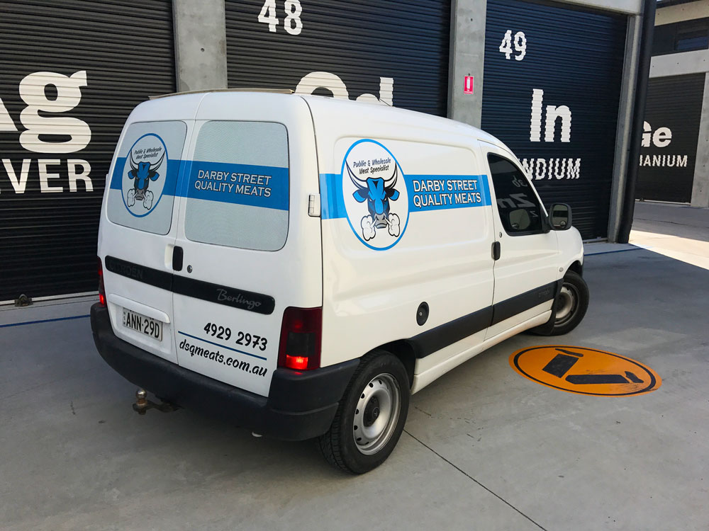
For the vehicles Kyle and Chanelle were just looking for something clean and not too loud. One way vision micro perforated film was applied to the rear windows and Hexis premium digital printing car vinyl on the sides and back panels.


Black Hill Public Sports feature wall

Our design team had a great time creating this master sports feature wall for Black Hill Public School.

Black-Hill-Public-School-aboriginal-signs-think-graphic-communication.jpg

School signs

Aboriginal theme designs and colours


Bright earthy colours, Aboriginal theme designs, bold simple lettering such a good mix for an effective layout.


Our finished product was impressive, above and beyond what we had hoped for!

The signs were printed and laminated using Hexis vinyl then mounted on high quality aluminium composite panel for strength and a smooth, even flat surface. This way the signs are easy to  maintain and produce a beautiful finish.


Black Hill Public School is a safe, happy and caring environment that fosters positive self-esteem, develops self-motivation and self-discipline, so that each student can realise their own individual potential and be prepared for future challenges.

Our school was looking for a way to finish off our sports houses feature wall in a dynamic way. We went to Think Graphic Communication and were provided with the perfect way to complete the job. The concept and design was based on a simple colour and name based information.
— Matthew Braye

If you like what you we did for Black Hill Public School and would like something custom made for your own school please feel free to contact one of our friendly help team


LDS 3D in Broadmeadow

Another local company has opened their doors- Land Development Solutions.

The Think Team worked along side Helen from Swish Concepts to design this clean modern signage for the front of the building.


Swish Concepts is a well- established and hardworking boutique interior design consultancy located in Hamilton. Owner and Principal designer, Helen Brunsdon, has worked in the design industry for many years and loves all things design related.


The street frontage was perfect cars driving past all the time

Keeping this in mind the signs were kept low and close to the road to maximise visibility if you were driving from up the road near The Sunnyside Tavern.

With such a strong black background colour, the reverse logo was opted for greater contrast and the Street numbers in blue up high on both sides for ease of recognition.

LDS-signage-before.jpg

Before

LDS-signage-think.jpg

After


Simple yet clean, routed 3D PVC letters in various thickness, were mounted on the 2 faces of the building


Leading a team of dedicated professionals, Directors Brian Blight and Jason Harman provide a wealth of experience gathered locally, nationally, and internationally.

From issuing of plans to issuing of titles, feasibility studies, council applications, surveying, engineer design, sewer & water design, project management. LDS provides prompt personalised service across the spectrum of development needs.

Diamonds are forever

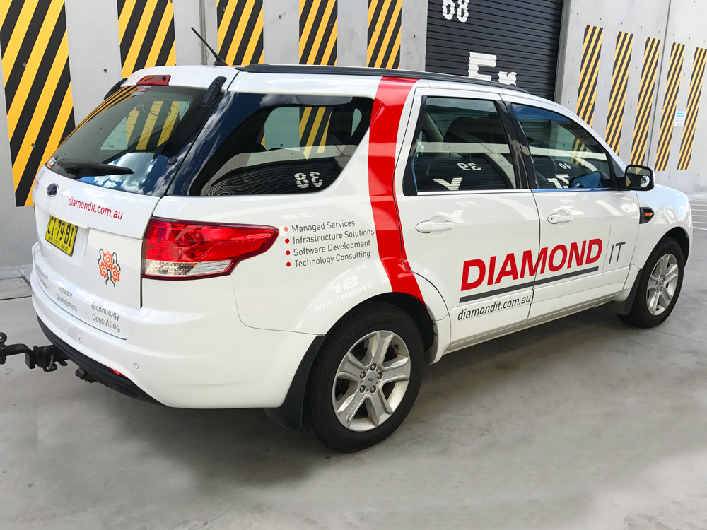
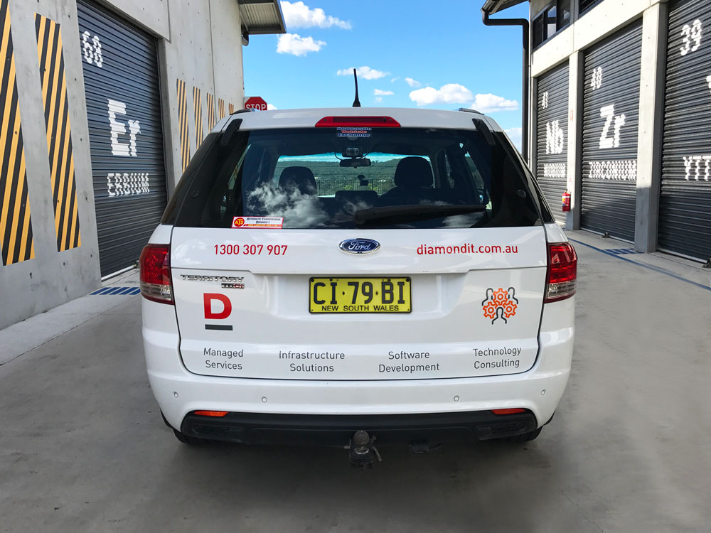
It is rare to find such gems to work with, but we were lucky enough to help Diamond rebrand their office space and vehicle graphics.

Jodie and Sam were great to collaborate with on this project. They knew what they wanted which really helps with the decision process. You can see the ladies seated in front of our privacy screen we installed for them


It was a bit exciting as the ladies were wanting to surprise their staff so we had to do a secret squirrel, which I found out meant we were undercover. This meant we had to attack this under the protection of darkness so no-one would see us.

Now I'm not sure if you know it but it is pretty hard to get water to evaporate in the freezing cold temperature, so this posed a little problem for us, but under the commandment of Jodie our mission was accomplished before the sun rose


Entering the building we installed a wall mount perspex sign with their logo-clean, simple

Diamond design team created some great posters which we mounted for them on PVC so they could place them around the office walls.


You cannot rebrand your company without changing your vehicles!

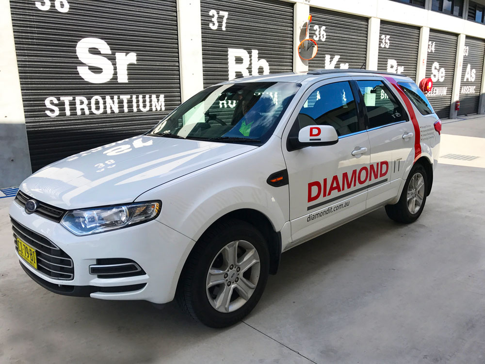
So that is exactly what we did. Once again we worked with Jodie and Sam to fine tune their vehicle layout again keeping the design clean and simple.


Diamond strive to provide you with the best possible ICT solutions.


As an award winning ICT Company, we recognise the importance of understanding and anticipating our customer’s needs so that we can deliver an exceptional customer experience that consistently exceeds expectations

Since 1996 they have built a solid reputation as an industry leader by focusing on and providing the following key benefits:

  • A single point of contact to a diverse ICT range
  • Quality products backed by great service
  • Expert advice you can trust
  • Friendly professional team with over 50 talented people that speak your language
  • Reliable solutions that meet your business needs

Not only do they pride themselves on their ability to deliver reliable and safe solutions, they also conduct themselves in a professional manner with a high level of integrity that allows them to contribute positively to their customer’s businesses and the wider community.

Big Red Nose - New Signs

Think Graphic Communication were proud to collaborate with Red Nose to donate new signs for their premises at Hamilton South


for 40 years they were known as sids and kids. today their new name is red nose.

Red Nose's target is to reduce nine deaths a day to zero. that's their pledge to you.


As you can see the building was in need of some TLC. It didn't appear very welcoming


The new signage was kept minimal as traffic moves at a steady pace along Stewart Avenue, and high on the building for better exposure.

A splash of red made everything look so much brighter

Routed Aluminium Composite panels and Hexis vinyl were used for the manufacturing of the signs

Red Nose Mission is very empowering

Our Mission
Saving the lives of babies and children  during pregnancy, infancy and childhood and supporting bereaved families.

If you would like to know more about Red Nose or how you too can support them please follow this link


Thank you !

— Kate Middleton
We are so thankful to Think Graphic for our fantastic new building signage! We are now more visible for our clients to find us, and we love that the round signage matches our big red nose. As a not-for-profit organisation, we are very thankful to local businesses who are able to donate their time and materials, which enable us to use our income to support families who have experienced the death of their baby or young child. This support includes free counselling, 24hr telephone support, parent support groups and more. Red Nose receives very limited government funding, so we are very reliant on donations and fundraising to keep our drop-in centre open.
Thank you Royce and Chanelle
— Kate Middleton

Newcourt Construction foundations laid

Newcourt is a design, building and construction company headquartered in Newcastle NSW, that invests and cares about their clients projects.

'We endorse "One Team, One Focus", by working collaboratively with our clients, consultants and subcontractors, ensuring that the project deliverables are achieved.'

Newcourt's primary asset is its experienced and dedicated team, that turn up each day with passion, energy and enthusiasm, to make our clients projects happen.


The logo design was kept clean and minimal, using colour and the bevelled constructions as the visual point

Creating another dimension gives the logo a greater depth and more substance

This style was carried through the whole marketing design


The use of a mobile billboard was not over cluttered as we kept the vehicle graphics in the same minimal manner

Both the website and business cards carried this feel of clean space and strength


view site


Achieving this brand image would not have been possible without first getting to know our client of course.

Without Fred's imput and vision for his future of his company we cannot create a memorable brand that is right just for him.

Our sole aim is to provide a service that will showcase the best of what you have to offer and expand your brand over all platforms.


Sportsclique signed and contained ready to kick off

Sports Clique opened their doors to the public outside the Azzurri Club and The Concept Gym at Highfields.

We were lucky enough to team up with Joel and design some bright and fun signage for them creating quite an impact on arrival. Magic was made using historical images of soccer legends such as Maradona,Zinedine Zidane , and clever posterised designs, turning the once boring shipping container into a work of art.


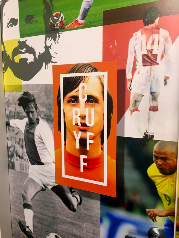
Obviously Joel is a mad soccer fan, so as you walk inside the container you are surrounded by more legends

• Johan Cruyff (puma legend) 

• Pele (puma legend) 

• Eusebio (puma legend) 

• Neymar jnr (current player) 

• Roy Keane (Manchester united legend) 

• Ray Baartz (Joel's uncle and ex Socceroo) 

• Ronaldo (old Brazilian Ronaldo not current Portuguese player Ronaldo) 

• Zinedine Zidane 

• Antoine Griezmann (current puma player) 

Baggio makes a striking entrance but not before he takes a quick selfie with Royce


Transforming the dull change room into a work of art was achieved by layering more legends,with bright colours and hand drawn sketches. The walls were prepared and covered with our printable wallpaper. As you can see this material can turn nothing to something it only takes a bit of imagination and the balls(excuse the pun) to be different.


We can't forget the outside. Kept these signs near the practice grounds at Azzurri simple and easy to read, but watch this space as there are more designs on the horizon for this canvas.

 
The team at think graphic were amazing to work with from start to finish, they provided me with a premium product at a very affordable price, and did it all with a smile on their faces and a good sense of humour. I’d highly recommend them to anyone
— Joel Grenell Owner | General manager Sportsclique Australia