Jolly to Pungky

Jolly Beans had an upgrade and is now Pungky Brewster.

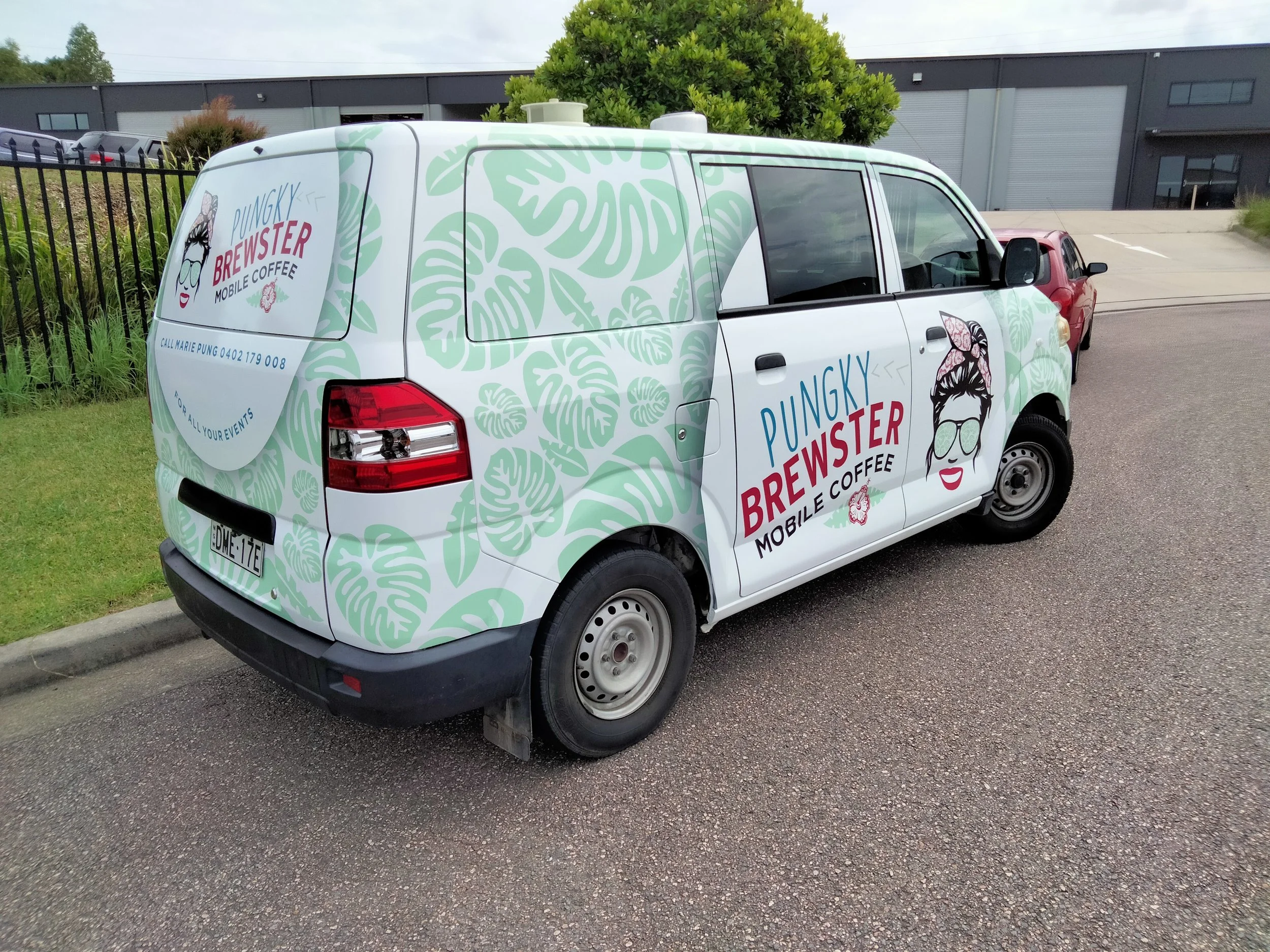
Working with Marie was a delight. Keep it the same but different! Same polynesian feel with the greenery and flowers, but wanted this logo to more reflect her own character. So was born the caricature with her signature head band. Same colours, different fonts.

logo design pungky brewster women in sunnies and head scarf, hibiscus flower

first came

the logo design

something fun but still keeping the same happy feeling

 
avp van before think car wrap

from this

boring white van

avp van with think car wrap

to this

outstanding billboard

Installation of the Pungky Brewster van wrap

For a van this was a great one to wrap. Perfect size, flat, lights and fittings were so easily to remove. It was a dream!

Using the Hexis cast film made the installation a breeze as this product is specially dedicated to full wraps, wall wraps or complex surfaces (rivets, corrugated metal). The combination of highly conformable cast vinyls and the HEX’PRESS technology offers high-quality results while reducing the application time

avp van think car wrap

Fresh Decals for Slam Engineering

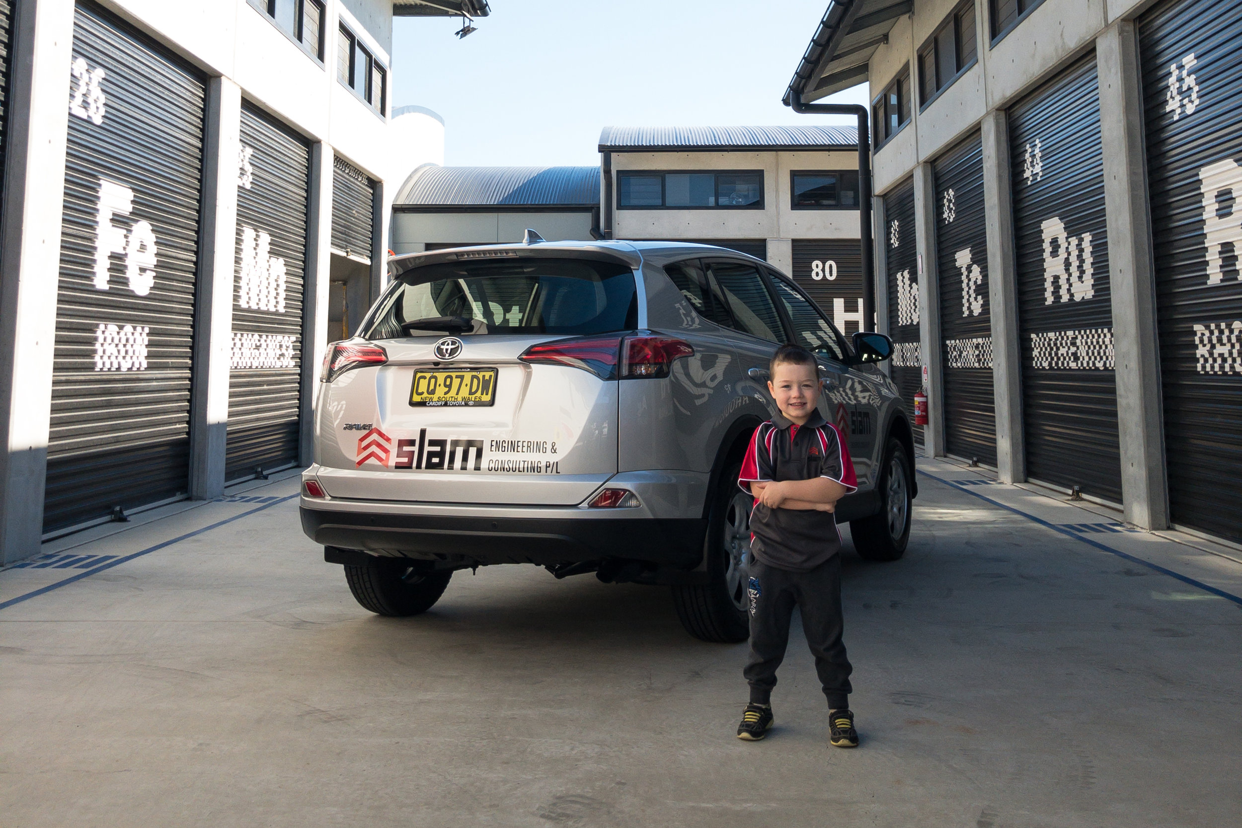
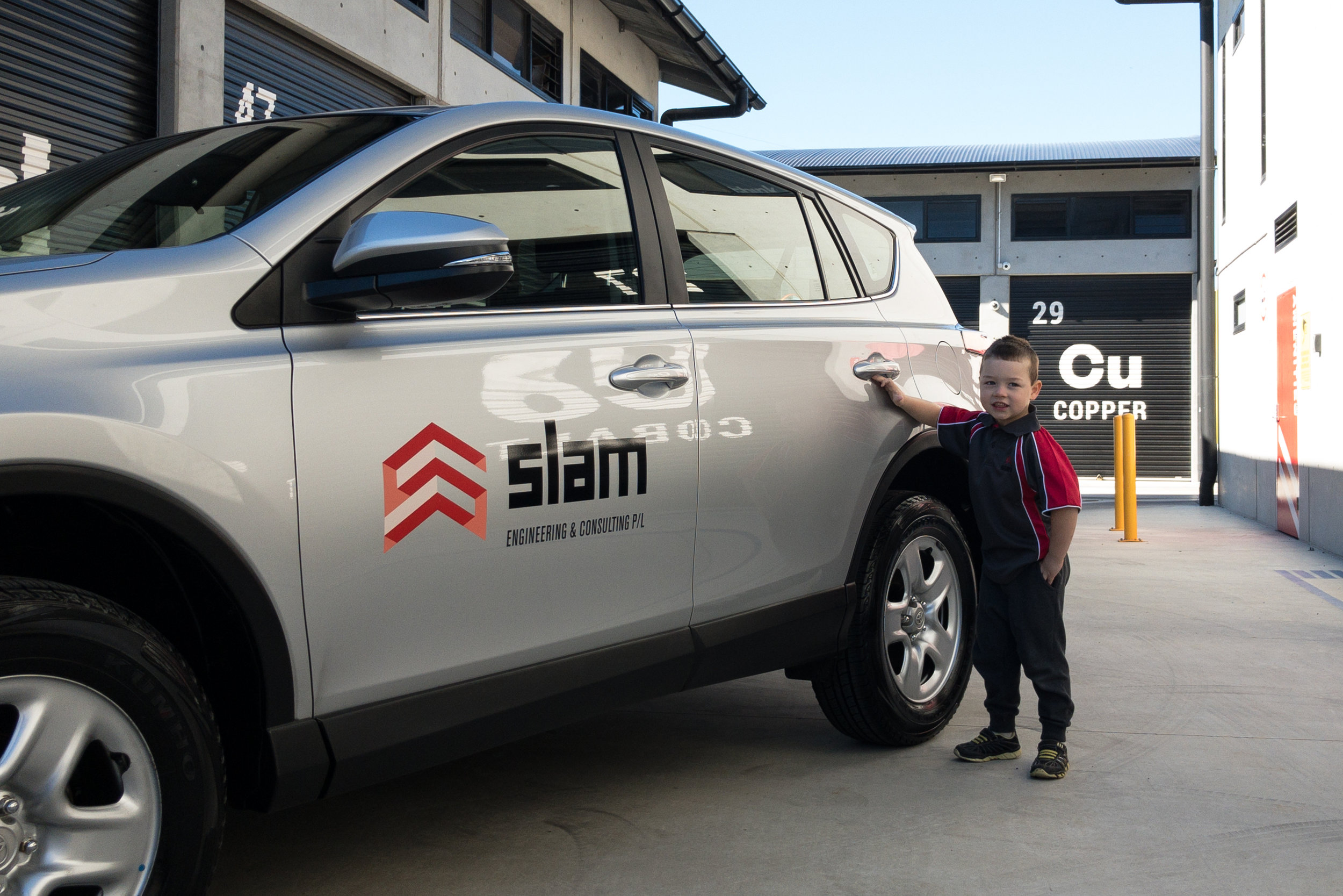
We were asked by our friends at Slam Engineering to apply their brand onto their new Rav4 vehicles. 
Simple and smart was our brief

Lucky their brand was well designed to accommodate for any format, so were able to design the decals to fit anywhere on the vehicle body.

MATERIALS USED


SKINTAC HX190WG2

Printable cast PVC film

This product is specially dedicated to full wraps, wall wraps or complex surfaces. The combination of highly conformable cast vinyls and the HEX’PRESS technology offers high-quality results while reducing the application time. 


Luckily the brand rep was happy with our work! I think his smile says it all.

(Yes there is a car behind our cute model)


For those who don't know the Slam Engineering & Consulting team have over 100 years mining experience

Working on, designing, leading and managing resources for fixed plant and mobile equipment maintenance.

This experience was obtained through working for major mining houses, large consultancy firms and respected suppliers for both open-cut, underground and processing operations in the coal, metalliferous and bauxite commodities.

printing service


Think Graphic Communication offer a state of the art efficient printing service to business and the public.

Our range of items include, but are definitely not limited to: Business Cards, Booklets, Letterheads, Brochures, Triplicate Books, Invitations and Calendars.

What sets our service apart from a lot of competitors is our trained graphics team and the speed of our response to your request.

Our aim is to make your purchase as carefree as possible.

Everyone has a special offer nowadays and Think Graphic Communication are definitely no different in that regard.

Jolly fun with coffee on the run

New on the streets Jolly Beans Mobile Coffee!

Jolly Beans came to us with an existing logo but they weren't quite happy with it, so we enjoyed updating their logo
The Think Team had fun creating this logo- tribal foundations,


bright happy colours, floral and fauna annnd coffee how could you not.


The colour palette was chosen to reflect Marie's bright, happy personality. We also tried to implement her heritage in our logo design.

Once you meet Marie you'll understand where 'Jolly' comes from in the name.

When everyone was happy with the logo concept the trailer design was created


jolly beans trailer unbranded.jpg

Jolly Beans mobile coffee trailer

clean and white white with great curves, before the fantastic happy makeover


Fresh, bold and joyful - that was the aim


jolly beans design.jpg

design concept

jolly beans in the making


As you can see from the photos taken from Marie herself and shared on her FB page, the final design turned out great!.

Simple, clean and bright

Only the best materials were used for the installation ensuring quality and durability for the prints.


I’m beyond happy with the signage on my coffee trailer. I had an idea in my head and Chanelle and the team brought it to life. The service was amazing, always got back to be quickly with design ideas. I can’t thank you guys enough and I will be back for some merchandise!
— Marie Pung
 

Darby Street Butchers branded

Think carved it up with Kyle and Chanelle at Darby Street Quality Meats rebranding their image.

I know what you saying... another Chanelle!!! Well you wouldn't believe it there are not 1 but 2 Chanelles working there, so I felt right at home

Back to the story

The crew were happy with the bull and blue colours of their original logo, but just wanted it to have a bit more grunt and attitude. 

darby street quality meats logoname in circle.png
darby street quality meats old logo.jpg

old logo

he was tough but not enough

darby-street-quality-meats-jerky.jpg

The Think Team also had to consider how the logo could be manipulated for the butchers meat tray labels and sooo delicious beef jerky labeling. OMG it makes my mouth water just thinking about it this stuff is goood. You have to try it!

So just the head of the beast was chosen, front on so you were looking straight into the eyes

We updated the front window keeping the image low to allow light and vision into the display. If you look up at the roof sign of the front facade you will also see the new logo standing proud overlooking the street.


Internally we got to have a bit of fun designing the feature wall

We noticed some old black and white photos of the butchers forever back in the hay day hanging on the wall. These had to be used in our design for the wall behind the counter. 

 
darby-street-quality-meats-internal-signs.jpg
 

The display cabinet has a static vinyl running across the top with whiteboard strips so specials can be hand written as they change, bit of a personal touch we thought. Inside the cabinet we designed labels for the variety of delicious meats they have on display, once again laminated with whiteboard panels allowing for hand written descriptions and ease of changing the labels.

 
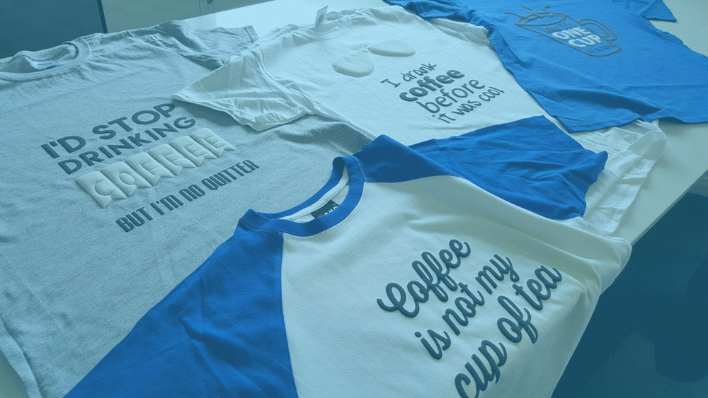
think-business-branding-on-tshirts.jpg

stamped

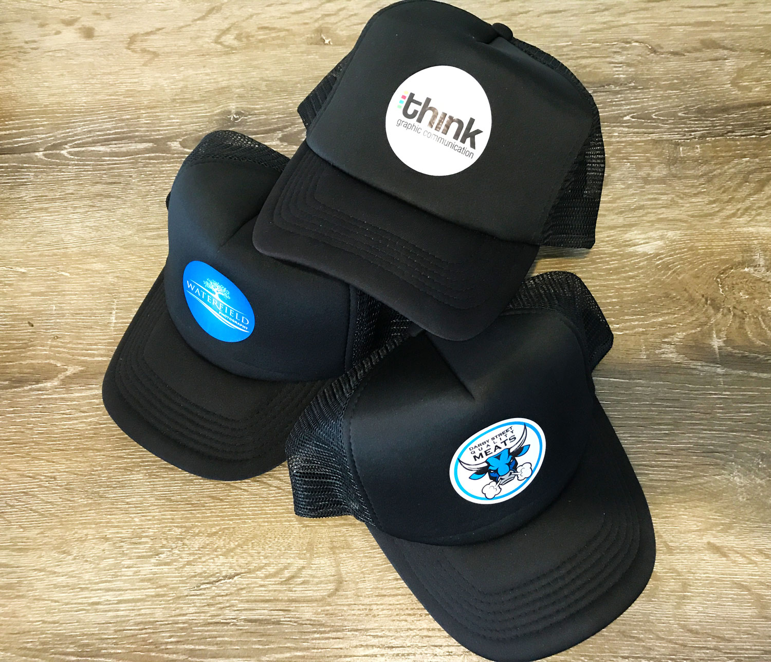
custom printed shirts, long sleeves and caps, mobile advertising


Vehicle signage

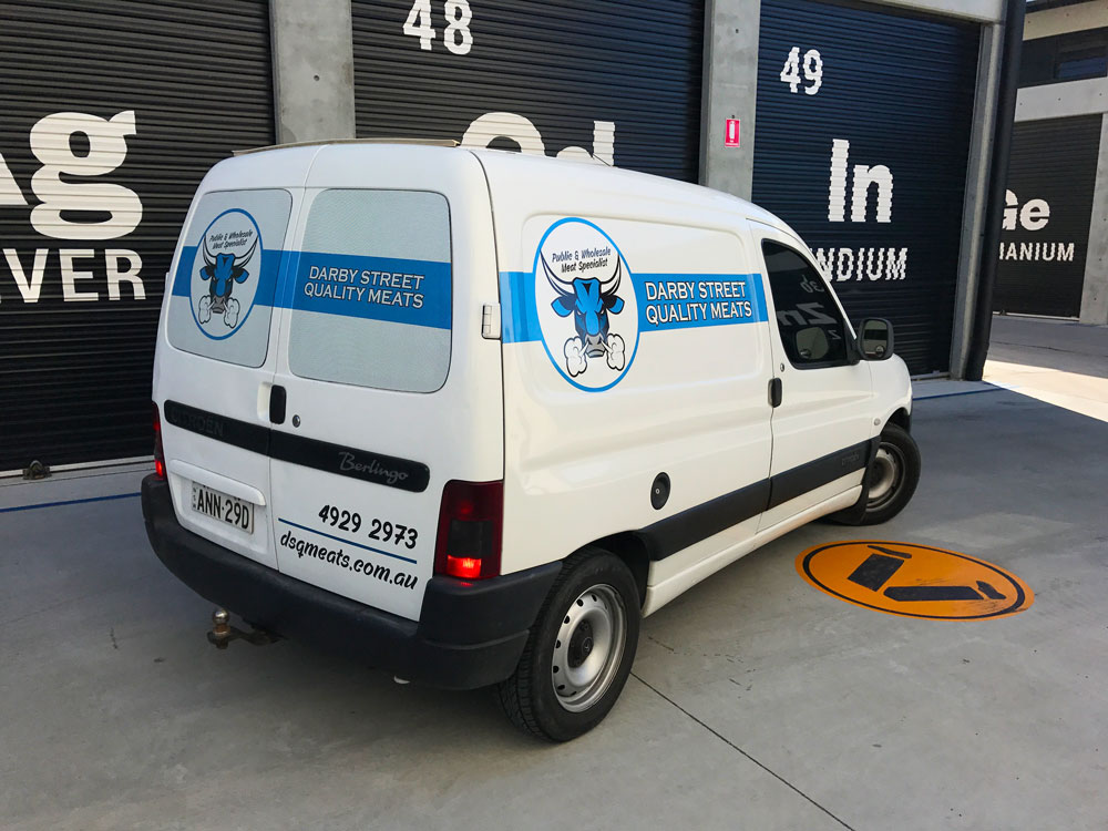
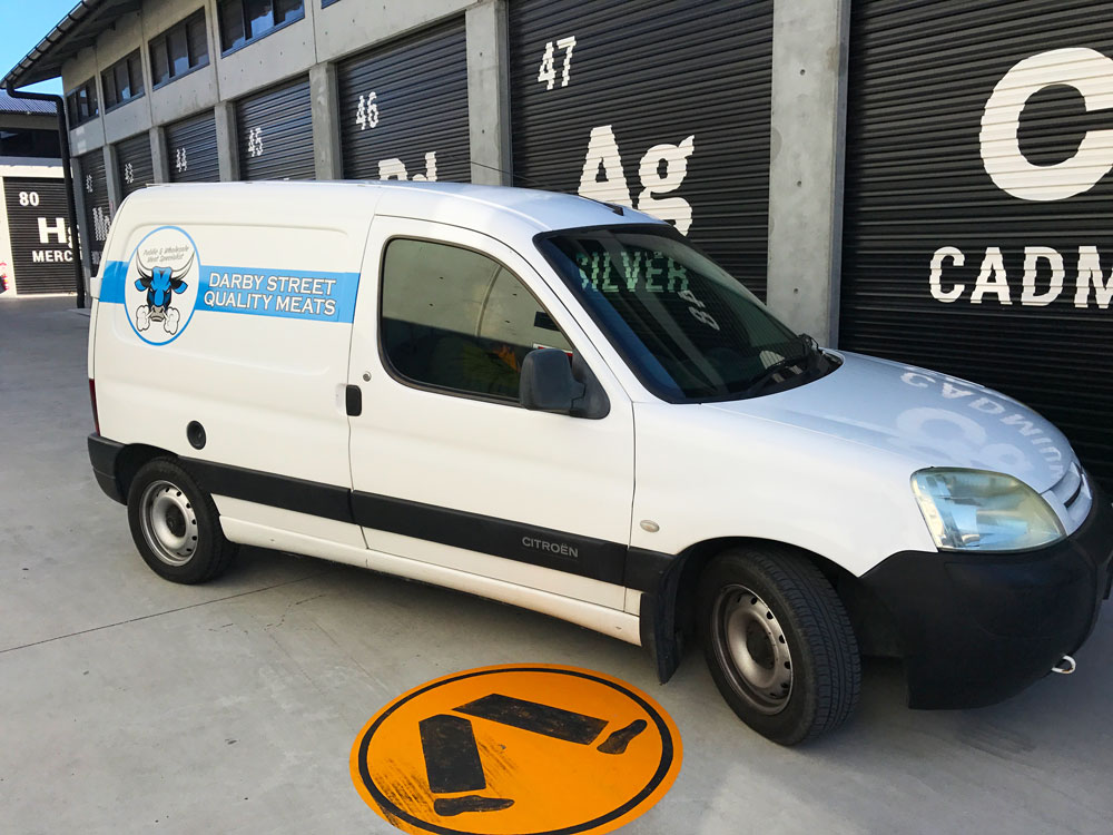
For the vehicles Kyle and Chanelle were just looking for something clean and not too loud. One way vision micro perforated film was applied to the rear windows and Hexis premium digital printing car vinyl on the sides and back panels.


Newcourt Construction foundations laid

Newcourt is a design, building and construction company headquartered in Newcastle NSW, that invests and cares about their clients projects.

'We endorse "One Team, One Focus", by working collaboratively with our clients, consultants and subcontractors, ensuring that the project deliverables are achieved.'

Newcourt's primary asset is its experienced and dedicated team, that turn up each day with passion, energy and enthusiasm, to make our clients projects happen.


The logo design was kept clean and minimal, using colour and the bevelled constructions as the visual point

Creating another dimension gives the logo a greater depth and more substance

This style was carried through the whole marketing design


The use of a mobile billboard was not over cluttered as we kept the vehicle graphics in the same minimal manner

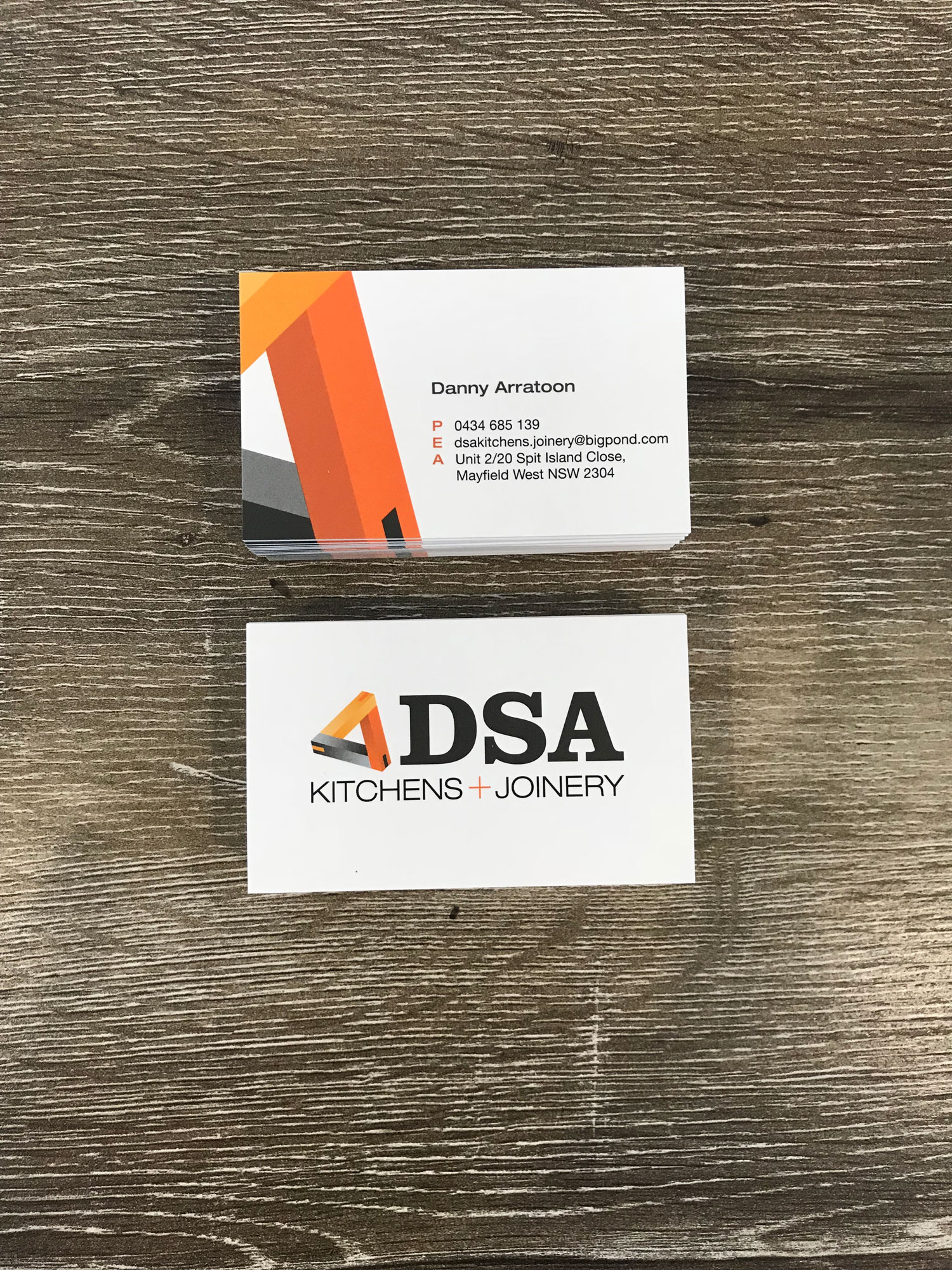
Both the website and business cards carried this feel of clean space and strength


view site


Achieving this brand image would not have been possible without first getting to know our client of course.

Without Fred's imput and vision for his future of his company we cannot create a memorable brand that is right just for him.

Our sole aim is to provide a service that will showcase the best of what you have to offer and expand your brand over all platforms.